Website Design
For Information Technology Professionals
Tom Worthington FACS
Visiting Fellow, Department of Computer Science, the Australian National University, and Director, Tomw Communications Pty Ltd, Canberra
For Internet, Intranet, and Document Systems (COMP3400/COMP6340), May 2002
Note: 2005 Version now available
Contents
- Introduction
- WebML: modeling language for designing Web sites
- Guidelines for Site Design
-
SOCOG Olympic Web Site and the
Disabled
- For slides see: Olympic Failure: A Case for Making the Web Accessible, Internet Society Conference, 8 June 2001, Stockholm.
- The Web on Small Screen: I-mode phones and Interactive TV
Introduction
The World Wide Web (Web) is a computer application which has become very popular. It provides a network of information resources, a uniform naming scheme for locating the resources, protocols for accessing them and hypertext navigation among the resources. Information technology professionals have decades of experience with computers and telecommunications. As web sites become larger and more complex IT professionals can contribute their experience into how to build such systems. IT professionals also need to learn about how graphic designers, librarians, journalists and marketers build web sites, to be able to design software for them.
The Discipline of Web Site Design
The information architect of a large, complex web site should be two things: someone who can think as an outsider and be sensitive to the needs of the site's users, and at the same time is enough of an insider to understand the site's sponsoring organization, its mission, goals, content, audiences, and inner workings. In terms of disciplinary background, the information architect should combine the generalist's ability to understand the perspectives of other disciplines with specialized skills in visualizing, organizing, and labeling information.Rosenfeld & Morville (1998)
Rosenfeld & Morville (1998) argue However, people have been designing information systems for electronic digital computers for about 50 years. The Australian Computer Society defines Information Technology as:
"the development and application of computers and communications-based technologies for processing, presenting and managing data and information" (ACS 1997).
After being involved in pioneering many early web sites, IT professionals have tended to be relegated to a technical support role in web site development. This can cause problems as the scale of web sites and their increasing functionality exceed the design skills of graphic designers, librarians, journalists and marketers. To be able to design web software and assist in the design of large scale web projects, IT professionals need to adapt their skills and learn some new web design skills.
There is no formal definition of what the World Wide Web (Web) is. However, the World Wide Web Consortium (W3C), which develops web specifications, describes it as:
... a network of information resources. The Web relies on three mechanisms to make these resources readily available to the widest possible audience:
- A uniform naming scheme for locating resources on the Web (e.g., URIs).
- Protocols, for access to named resources over the Web (e.g., HTTP).
- Hypertext, for easy navigation among resources (e.g., HTML).
W3C (1999)
| Locating | uniform naming scheme | URI |
|---|---|---|
| Accessing | Protocols | HTTP |
| Navigating | Hypertext | HTML |
The ACS Core Body of Knowledge
The Australian Computer Society divides the aspects of IT into:
Areas of Knowledge
- Computer Organisation and Architecture
- Conceptual Modelling
- Database Management
- Data Communications and Networks
- Data Structures and Algorithms
- Discrete Mathematics
- Ethics/Social Implications/Professional Practice
- Interpersonal Communications
- Program Design and Implementation
- Project Management and Quality assurance
- Information Security
- Software Engineering and Methodologies
- Systems Analysis and Design
- Systems Software
From Core Body of Knowledge for Information Technology Professionals (ACS 1997)
The major challenge in IT is to discover what the client wants, what might achieve that need, to reliably build a system to meet the need and then ensure the system operates into the future. As web sites become larger and more complex the Body of Knowledge built up for IT can be applied to the web. Some examples:
- Computer Organisation and Architecture: High volume web sites test the limits of available hardware. A study of the principles of operation of the components of a computer system allow a design to be optimized to meet performance requirements. Mobile and iTV web devices and embedded systems in set-top boxes have limited capacity, requiring an appreciation of how the hardware will affect the development of web systems. How to design web pages for mobile and iTV devices will be discussed in detail later.
- Conceptual Modelling: A major problem with the development of ever larger web sites is the lack of tools to deal with the complexity of design. Conceptual modelling provides tools for abstraction to find patterns in the problem and simplify design. One example is entity relationship models, originally developed for database design. How these models can be used for the design of the web site structure will be discussed in detail later.
- Data Communications and Networks: Large web sites impose significant loads on a network. A large site may need to be spread geographically to balance load and the different characteristics of internal LAN and wide area networks must be considered. The security requirements of the web site need to mesh with those of the underlying network. How to design web pages to adapt to available bandwidth will be discussed.
- Ethics/Social Implications/Professional Practice: The design of web sites involves legal, social and ethical issues of a magnitude not seen before in IT. The newness of the Internet and the public visibility of web sites create major problems for web site design. Whereas these issues might have come up a few times in the career of an IT professional, with the web they will occur in almost every project. The requirements for the design of web sites for the disabled will be discussed in detail.
Web Design
- Hypertext: The use of a hierarchy of web links is a convention imposed by the designer for the convenience of the reader. Links can be from anywhere in and web page to any other. In practice this freedom can lead to confusion for the reader and is generally used for supplementary links. An example of good use of hypertext is in the introduction to the Government Online Strategy.
- Database: Rather than use web pages and links which are statically created, much as paper documents, web pages can be generated from a database. Relational databases are generally used to hold the web site content. Templates with the structure of standard page designs are used to give the design for a particular site. Content is then filled into the templates in response to user requests. While in theory each page could look radically different (and different each time read), in practice a structure similar to statics pages is used to avoid confusing the reader. An example of a database generated web site is the Australian Governments' Business Entry Point.
- Programmatic: Advanced web features, such as XML and cascading style sheets, can be used to provide a look more like that of a computer application than a document. Programming languages, such as Java, can be used to provide an interface similar to a computer game. JPEG 4 can be used to provide a 3d interface with animation, live video and sound. However, such interfaces are not in common use. In most cases the advanced features are used to supplement a conventional design. An example is the St George Java based Internet banking system.
Designing Navigation Systems: Examples
- Building Context: Commonwealth Government Entry Point and Department of Defence.
- Remote Navigation Elements: EdNA site map, search facility. AIS Site Map
Browser Navigation Features
Commonly used conventions for web navigation have been established by popular browser programs. Some applications, such as micro-browsers embedded in appliances, may justify not using these navigation conventions. Also it is possible to switch off or override some browser controls for some applications, such as public web kiosks. However, for most web site design it should be assumed that the conventions will be worked with.This also assists where additional hardware or software is used to provide access for the disabled.
Building Context
Readers can get lost as to which web site they are in and where they are. The navigation system can provide clues as to where the user is and was. Examples are a navigation bar across all web pages or a fixed menu frame in a multi-frame site. Examples are the fixed top and bottom menus on the the Commonwealth Government Entry Point. and the fixed left frame on the Department of Defence home page.
Remote Navigation Elements
With most web sites based on a paper book model, it is natural to include a title page (or "splash page"), table of contents, a site map (detailed table of contents) and an index. In some designs the site map doubles as a more accessible table of contents. Few sites have an index, but instead have a search facility. A search facility provides less context for the reader than an index, as the search finds what is there, not what else may be near it.
EdNA (The Education Network Australia) has a "splash page" which appears for a few seconds before the contents page loads. The site map uses a simple design with headings from the contents page and then one level of details. A confusingly powerful search facility is provided. An index called a "browse map" is provided.
Conceptual Design
High-Level Architecture Blueprints: No widely accepted modelling or diagramming techniques exist for web site design. IT professionals may be able to adapt Conceptual Modelling methods, such as those used for relational data and Software Engineering Methodologies used for requirements analysis functional and technical specifications process, data and object orientation models.
An example of an attempt to develop web site modelling is WebML (Ceri et al 2000), of which the entity-relationship modeling section will be discussed in detail later.
Structure Charts and Site Maps
Lengel (2002) describes the use of Structure Flow Charts in chapter one as an aid to designing a web site. In chapter two they describe the use of site maps to describe the web site for the user and comment "the flow chart you developed for your site in chapter one is a site map". In practice site maps rarely use diagramming and usually use indented text. Also the use of the term "flow chart" does not match that of computer science, where a flow chart show the flow of control in a computer program, not the structure of the data or of the software modules.
Site Map as a Diagram:

From: Site map for Australian Heritage Commission web site, Australian Heritage Commission, 1999
Site map as text:
- About Us
- EdNA Online Policies
- Content Standards (Schools)
- Usage of Collaborative Tools
- EdNA Online Principles
- Privacy Policy
- Publishing Guidelines
- News & Views Guidelines for Contributors
- Terms and Conditions
- Sitemap
- Feedback
- Suggest a Site
- Admin Access
- Help...
From: EdNA Online - Sitemap, Education Network, 2001
Worthington Methodology for Quick Web Site Design
The design is based of a paper book provides a familiar hierarchical structure for a web site:| Book | Web Site |
|---|---|
| Cover | Splash Page |
| Front Matter, Foreword, Preface | Home Page, About Page, FAQs, Contacts |
| Table of Contents | Main Menu |
| Chapters | Pages |
| Back Matter, Bibliography, Index | Other Sites, Index Search |
To quickly turn a conventional book or report into a web site:
- Obtain an electronic copy of the approved, typeset document.
- Save the document in web format.
- Replace presentational markup with structural markup and style properties. For example replace explicit font sizes and colors with standard heading level codes (such as <H3>) and styles. The Tidy program assists with this.
- Resize or delete excessively large graphics.
- Separate content into web pages: cover page to "splash page", table of contents to home page, chapters to web pages.
- Add extra navigation, such as a replacement for the paper index, some hypertext and sub-menus.
- Coalesce some pages and edit some content. For example condense part of the introduction onto the home page.
- Check the document and after approval publish it online.
This process can reduce the production of a web site from months or weeks to a few hours. If there is time later, graphics and additional styling can be added to enhance the look of the site.
Examples of quick sites:
- Special Broadcasting Service web site: prepared from an A4 brochure overnight and launched the next day,
- Architecture For Access To Government Information, Information Management Steering Committee Technical Group, Office of Government Information Technology, 1996: a Government report reformatted for the web,
- Universal Service? - Telecommunications Policy In Australia and People with Disabilities by Michael J Bourk, 2000, ISBN 0 646 39159 3: A book reformatted for PDF and the web.
Public web sites need publicity to attract readers. The content of the site can be summarised and converted to announcements and presentations.
Introduction to WebML
Web Modeling Language (WebML) is a notation for specifying complex Web sites at the conceptual level. WebML enables the high-level description of a Web site along multiple dimensions:
- its data content (structural model),
- the pages that compose it (composition model),
- the topology of links between pages (navigation model),
- the layout and graphic requirements for page rendering (presentation model),
- and the customization features for one-to-one content delivery (personalization model).
From: "Modeling the CDNOW Web site" by Aldo Bongio ( ZIPped PPS, 323 Kb; PowerPoint Viewer required) (Ceri et al 2000).
The remainder of this section will discuss the data modelling aspects of WebML using excerpts from a the pre-publication draft of the book "Designing Data-Intensive Web Applications" by Ceri, Fraternali, Bongio, Brambilla, Comai, Matera, February, 08 2002 (used by permission of the authors).
Data Content
Focusing on the first dimension (data content):
Data modeling is one of the most traditional and consolidated disciplines of the Information Technology, one for which well established modeling languages and guidelines exist. For this reason, WebML does not propose yet another data modeling language, but exploits the most successful and popular notation, namely the Entity-Relationship (E-R) model.
The essential elements of the Entity Relationship model are entities, defined as containers of data, and relationships, representing semantic associations between entities. Entities are described by means of attributes and can be organized in generalization hierarchies. The WebML data model slightly simplifies the classical Entity Relationship data model, by leaving out a few primitives, like generalized N-ary relationships, which are relationships involving more than two entities, and relationships with attributes. These omissions do not diminish the expressive power of the WebML data modeling language, because the missing primitives can be simulated by the use of entities and binary relationship, which are relationships involving only two entities. A positive consequence of this simplification is that the WebML data model is simpler to learn and more compatible with the UML notation for class diagrams, which allows only binary relationships.
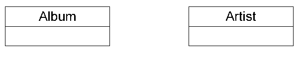
Entities
... An entity represents a set of objects of the real world, characterized by common properties and having an autonomous existence. Examples of entities are person, car, artist, and album. An entity is a statically defined concept, a descriptor of the set of common properties. Associated to an entity there are the actual objects, which exhibit the properties specified by the entity. These objects constitute the population of the entity, and they are the real content of the application at a certain point in time: a certain set of persons, of cars, and so on. The objects of an entity all share the common properties (also called attributes) dictated by the entity they belong to: persons and artists have a name, cars have a model and a make, albums have a title, a year of publication, and so on. The notion of entity corresponds to the concept of object class of UML, but for the fact that UML classes permit the designer to specify not only the attributes of objects, but also the functions applicable to them, in the spirit of object-oriented modeling.
Two Entities
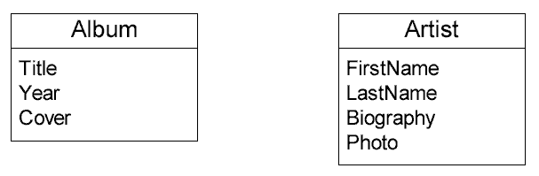
Attributes
Attributes are used in the WebML model to represent the properties of real world objects. Examples of attributes are the name , address, photo, and the personal home page of a person. The WebML graphical representation of attributes is depicted ... attributes are listed inside the entity box, below the entity name. In the example, attributes Title, Year and Cover are defined for entity Album, and attributes FirstName, LastName, Biography and Photo characterize entity Artist. WebML attributes are restricted to take at most one value, and it possible that an object has no value for some of its attributes. As the notation ... suggests, WebML attributes correspond to class attributes in UML.
Graphic notation for entities and attributes
Keys
... one or more attributes of each entity may be marked as a primary key, to express that they uniquely identify the entity objects. Key attributes must satisfy a few restrictions, not requested for regular attributes. Their value must be defined for every object of the entity, and there should not exist two objects with the same value of the key attributes. The specification of primary keys is optional, but their specification is recommended because they are useful also for the hypertext model, where key attributes can be used to represent the entity instances in certain navigational structures, like indexes, offered to users to let them select objects out of a collection. ... Attribute Title is chosen as the primary key of Album , while the pair of attributes <FirstName, LastName> is the primary key of entity Artist. Graphically, key attributes are distinguished by a small key con placed at the right of the attribute’s name.
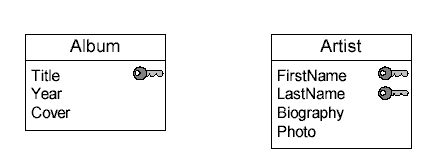
Graphic notation for primary keys
Data Types
WebML attributes are typed, which means that they assume values from well-defined domains. WebML supports standard built-in data types, as well as user-defined data types. The former are the primitive types typically provided by the most common programming languages, the latter are defined by the user. Built-in data types include...
Data type Brief description String A “short“ sequences of characters Text A “long“ sequences of characters Integer An integer numerical type Float A floating point numerical type Boolean A true or false value BLOB A Binary Long OBject, for example an image or a video, which must be handled in a special way because of its size. Blob types can be further refined by expressing their MIME type (for example image/gif) URL A Uniform Resource Locator of a Web page
User-defined data-types are specified as enumerated domains, which are finite, ordered sets of values. For example, the user may specify a new type named SupportType with the three different values, e.g., “CD”, “Tape” or “Vinyl”...
IS-A Hierarchies
The WebML data model permits the designer to organize entities into a hierarchy, where they share some common features. This IS-A hierarchy (also called generalization hierarchy or specialization hierarchy) has one super-entity and one or more sub-entities. The sub-entity inherits all attributes defined in the super-entity and may add locally-defined attributes and relationships. For example JazzArtist and PopArtist are sub-entities of Artist, and JazzArtist has an extra attribute Instrument, specifying the instrument played by a jazz artist.
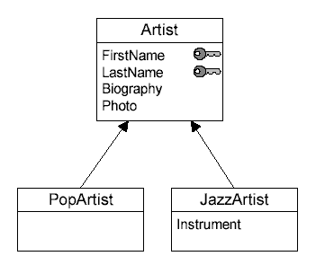
Graphic notation for IS-A hierarchies
Relationships
Relationships represent semantic connections between entities, like the association between an artist and his/her album... The WebML notation supports binary relationships without attributes, which are relationships connecting two entities. In this respect, WebML relationships are simpler than in the Entity Relationship model, where relationships may connect more than two entities and have attributes, and also simpler than class associations of UML, which are binary but may be extended with attributes.
Relationship roles can be annotated with minimal and maximal cardinality constraints, denoting respectively the minimum and maximum number of objects of the destination entity to which any object of the source entity can be related.
- Relevant values for the minimal cardinality are zero or one; a relationship is said to be optional for its source entity if the minimal cardinality is zero, and mandatory otherwise. Mandatory relationships introduce existential dependencies between entities, because an object of the source entity cannot exist without being associated to at least one object of the destination entity.
- Relevant values for maximal cardinalities are one or many, denoted as "N".
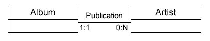
Based on their maximum cardinality constraints, relationships are called as “one-to-one”, if both relationships roles have maximum cardinality 1, one-to-many”, if one relationship role has maximum cardinality 1 and the other role has maximum cardinality N, or “many-to- many”, if both relationships roles have maximum cardinality N. ... WebML graphic notation for a relationship called Publication, defined between entity Album and entity Artist. An album is associated to exactly one artist (cardinality 1:1), and each artist may be associated to several albums (cardinality 0:N); thus, the role from album to artist is mandatory, while the role from artist to album is optional. The relationship is “one-to-many”, from one artist to his multiple albums.
Graphic notation for relationships
Complex Example
... a simple data schema describing albums and artists information. Artists publish albums composed of tracks, and have reviews of their work. Artists have a name, a biography, a picture, date and place of birth, and, possibly, date and place of death. Artists are partitioned into jazz artists and pop artists, the former being characterized by an instrument. Albums have a title, year of publication and a cover picture, and each track of the album is characterized by a number, a title and its duration. Each album is available on different supports, like CD, tape and so on, and each support has a list price, a discount and an actual price. For each review associated to an artist, the author of the review is known and the text containing the review is available. Cardinalities between entities are also defined: a review is associated to a single artist, an artist may have several reviews and may have composed several albums; an album is of a unique artist, may have different supports, and contains many tracks; finally, a track belongs only to an album.
The Album, Artist and Review entities include the definition of primary keys, either consisting of a single attribute or of multiple attributes. Conversely, Support and Track are examples of entities for which no meaningful primary keys can be defined, because for both entities no “reasonable” combination of attributes is sufficient for identifying uniquely the entity’s objects. For example, attribute Title may appear a good candidate key for entity Track, but is discarded because there may be two tracks in different albums with the same title.
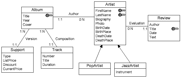
Data schema in WebML for the Cdnow Web Site
This technique might be applied to analysis of a complex site, such as fed.gov.au
Guidelines for Site Design
Web site designers must balance the needs of the intended users of the web site, the demands of the client and the capabilities of the network and computer equipment. Unlike computer applications for use in an organisation, the web designer has little control over the computer network and equipment used to display their work. Ideally the web site should be first designed to function on a small screen with one column of monospaced, monochrome font text. The design can then be enhanced with fonts, color, images and multiple columns, if required. The overall structure of the site should be designed using a site map after use of E-R modelling or other analysis techniques. The ANU's Timetable system could benefit from having its structure made viable to the user.
Aspect Ratio and Display Size
The web designer should try to cater for the greatest range of screen sizes and shapes possible (techniques for this are discussed below). Lengel (2002) in chapter three, suggest that most modern monitors have a display size of 800 pixels wide by 600 pixels high. However, many older computers and web appliances have a screen 640 x 480 pixels. Hand held devices and internet TVs have smaller screen(discussed in detail below). Most screen have an aspect ratio of 4:3, but wide screen TVs are 16:9 and some PDAs have square 1:1 screens. An application designed specifically for a 800 x 600 screen may not be usable on a 320 x 240 internet TV. A particular problem is a fixed layout which does not allow the text to wrap to fit on a narrower screen, as some devices do not have horizontal scrolling to allow all text to be seen.Layout
Web pages are traditionally layed out in a similar way to printed text, in a regular pattern, with more general information at the top left (for English publications). In general web pages should be laid out following this pattern, but having too rigid a design can result in a dull design and the reader being unable to distinguish one page from another in the web site. The layout should, as far as is possible, allow for screen of different resolutions. Cascading Style Sheets (CSS) include commands for positioning elements on a web page. However, these parts of CSS are not well supported by some browsers and it may be necessary to use <TABLE> commands to position text.Text
Text should be sized relative to the default size set by the browser and styled using Cascading Style Sheets (CSS) based on the structural elements of the document. The ANU has a standard style sheet "http://www.anu.edu.au/templates/anustyle.css":H1, H2 { font-family: Arial, Helvetica, sans-serif; font-style: normal; font-size: medium; color: #000000 }
H3 { font-family: Arial, Helvetica, sans-serif; font-style: normal; font-size: medium; color: #000000 }
H4 { font-family: Arial, Helvetica, sans-serif; font-style: normal; color: #000000 }
H5 { font-family: Arial, Helvetica, sans-serif; font-style: normal; color: #000000 }
H6 { font-family: Arial, Helvetica, sans-serif; font-style: normal; color: #000000 }
TBODY, BODY, TABLE, TD, BLOCKQUOTE, FORM, LI, OL, UL, DD { font-family: Arial, Helvetica, sans-serif; font-style: normal; font-size: small; color: #000000 }
P, p { font-family: Arial, Helvetica, sans-serif; font-style: normal; font-size: small; color: #000000 }
A { font-family: Arial, Helvetica, sans-serif; font-style: normal; font-size: small; }
A:hover { color:red }
This is referenced in the Discover The Australian National page HEAD:
...
<HTML>
<HEAD>
...
<LINK href="/templates/anustyle.css" rel="stylesheet" type="text/css">
Later in the HEAD an additional style of tinylink is defined for use anywhere on the web page:
<STYLE> .tinylink { font-family: Arial, Helvetica, sans-serif; font-size: 8pt} </STYLE>
</HEAD>
In the body of the document some font commands are used:
<BODY ...
<FONT SIZE="-2" face="arial, verdana, helvetica, sans-serif"> <center> Please direct ...
As well as the additional style:
<A HREF="/comments.php" class="tinylink">...
The effect of the styles cascade, that is the local style overrides the definition in the header and that overrides the external definition. In this case the font size will be changed, while the font color will be unchanged.
Fixing text at, 12 points, for example as suggested by Lengel, will cause difficulties if the user's screen is significantly smaller or larger than that the page was designed on. Web browsers have a default font size which should have been set to be readable on the particular screen. Most text on the web page should be set at the default size and other text, such as headings, should be set relative to default size. Serif fonts (such as Times Roman) are generally considered easier to read for main text, but sans serif (such as Helvetica) are better for low resolution screens and headings. As with text size specific fonts should be avoided and style commands used to suggest fonts for specific elements of the text. As an example a heading should be marked as a heading <h1> and then styles added for text size and font.
In this way if the browser does not have the specific font (or the user can't see it), another can be substituted in a systematic way. Utiltiy programs, such as Tidy, can be used to extract collect text defnitions from a web page into a CSS style sheet. An example of a web page using individual defninitions is Links on the World Wide Web (Spool 1999). An example of a web page using an internal CSS style sheet is The Federal Government 30% Rebate (HIC 2001). An example of a complex style sheet is that for the W3C's documents: http://www.w3.org/Style/main.css This includes comments indicating some style commands cause difficulties with some web browsers.
Images
GIF, JPEG and PNG provide lossless formats for perfectly rendering images, such as logos and diagrams. JPEG provides a lossy format, which will render a not completely accurate version of the image, which is useful for photographs. Images should be sufficiently large to display on the largest anticipated screen, but not so large that they waste bandwidth and storage. Each image which conveys information should be accompanied by a text caption which describes the image for readers who can't see the images. Decorative images do not require captions (and should have a null ALT tag). Including the size of the image in the IMG statement will aid the web browser to lay out a web page quickly. Similar considerations apply to animations, sound and video.Color
The web site should have a consistent color scheme, using a small number of colors. This can be best achieved by using styles to apply colors to all elements. Color should not be relied on to convey information as some people can't see some colors, or may have a monochrome screen.
Links
Spool (1999) suggests that longer text links work better than cryptic ones: "When people are searching for information, they pick links based on their expectation of the page the link will take them to.". Image links when combined with text may be better:
Users sometimes made their decision and clicked on the text (which wasn’t a link) before the GIF links even appeared, so clearly the additional information helped them decide...
A weak positive correlation exists between image links (such as graphics that look like buttons) and user success. However, we saw one minor problem with image links: because they don’t change color after the user clicks them, there is no visual cue that they have already been traversed. Users did use visual cues to initially identify the image links by moving the mouse across the page and watching for the cursor to change to Netscape Navigator’s pointing finger.
Web Site and the Disabled: The SOCOG Olympic Web Case
- In August 2000 the Sydney Organizing Committee for the Olympic Games was found to have engaged in unlawful conduct by providing a web site which was to a significant extent inaccessible to the blind. How was an analysis of the content of such a large web site carried out? What features were looked for? How was the impact of changes to the site estimated?
Excerpts from: Olympic Failure: A Case for Making the Web Accessible
Web accessibility guidelines have been developed to assist designers to make web sites which are available to the greatest range of users of the Internet. The most respected guidelines are those from the World Wide Web Consortium (W3C 1999):
For those unfamiliar with accessibility issues pertaining to Web page design, consider that many users may be operating in contexts very different from your own:
-
They may not be able to see, hear, move, or may not be able to process some types of information easily or at all.
-
They may have difficulty reading or comprehending text.
-
They may not have or be able to use a keyboard or mouse.
-
They may have a text-only screen, a small screen, or a slow Internet connection.
-
They may not speak or understand fluently the language in which the document is written.
-
They may be in a situation where their eyes, ears, or hands are busy or interfered with (e.g., driving to work, working in a loud environment, etc.).
-
They may have an early version of a browser, a different browser entirely, a voice browser, or a different operating system.
Content developers must consider these different situations during page design. While there are several situations to consider, each accessible design choice generally benefits several disability groups at once and the Web community as a whole. For example, by using style sheets to control font styles and eliminating the FONT element, HTML authors will have more control over their pages, make those pages more accessible to people with low vision, and by sharing the style sheets, will often shorten page download times for all users. (W3C 1999)
On 7 June 1999 a complaint was made to HREOC, by a blind person that he was unlawfully discriminated against by SOCOG in three respects: the failure to provide braille copies of the information required to place orders for Olympic Games tickets; the failure to provide braille copies of the Olympic Games souvenir programme; and the failure to provide a web site which was accessible to the complainant. The Ticket Book component of the complaint was dealt with on 30 September 1999 and Souvenir programme, 27 March 2000.
The complainant requested that the HREOC make the following orders or declarations:
-
That SOCOG include ALT text on all images and image map links on the website;
-
That SOCOG ensure access from the Schedule page to the Index of Sports; and
-
That SOCOG ensure access to the Results Tables on the web site during the Olympic Games. (HREOC 2000)
A decision on the web accessibility was delivered 24 August 2000 (HREOC 2000), with SOCOG found to have engaged in unlawful conduct by providing a web site which was to a significant extent inaccessible to the blind. The web site ordered to be made accessible by the start of the Sydney Olympics. On 6 November 2000 (after the Sydney Olympics) the web site was found to only be partly complaint and $20,000 damages were awarded (HREOC 2000c).
On 27 April 2000 the following pages were inspected (these pages may have changed since this inspection was carried out):
- Home page: http://www.olympics.com/eng/index.html/eng/home.html
- Prints offer: http://www.olympics.com/eng/about/programs/Fine_art.html
- What's on December 1999: http://www.olympics.com/eng/schedule/Event_1299.html
The web pages were displayed using Internet Explorer (Version 5.0 for Windows 95), with image display switched off (to simulate use by a blind person). The display of the web pages was inspected for usability and then an examination of the HTML source code made. It should be noted that a more detailed analysis would be required to more formally rate the site, but this was not required, nor was it feasible.
Problems found and compliance with Web Accessibility Guidelines were summarised as:
i. W3C Recommendation Web Content Accessibility Guidelines 1.0, 5-May-1999 at (http://www.w3.org/TR/1999/WAI-WEBCONTENT-19990505 ).
From: Guideline 1. Provide equivalent alternatives to auditory and visual content. Checkpoints ( http://www.w3.org/TR/1999/WAI-WEBCONTENT-19990505/#gl-provide-equivalents ):
“1.1 Provide a text equivalent for every non-text element (e.g., via “alt”, “longdesc”, or in element content). This includes: images, graphical representations of text (including symbols), image map regions, animations (e.g., animated GIFs), applets and programmatic objects, ascii art, frames, scripts, images used as list bullets, spacers, graphical buttons, sounds (played with or without user interaction), stand-alone audio files, audio tracks of video, and video. [Priority 1]”
Guideline 5. Create tables that transform gracefully. ( http://www.w3.org/TR/1999/WAI-WEBCONTENT-19990505/#gl-table-markup )
“5.1 For data tables, identify row and column headers. [Priority 1] For example, in HTML, use TD to identify data cells and TH to identify headers.
5.3 Do not use tables for layout unless the table makes sense when linearized. Otherwise, if the table does not make sense, provide an alternative equivalent (which may be a ). [Priority 2]“
From: Guideline 1. Provide equivalent alternatives to auditory and visual content. Checkpoints ( http://www.w3.org/TR/1999/WAI-WEBCONTENT-19990505/#gl-provide-equivalents ):
Checkpoints:1.1 Provide a text equivalent for every non-text element ...
For image maps, either use the “alt” attribute with AREA, or use the MAP element with A elements (and other text) as content. “
ii. AusInfo Guidelines at http://www.ausinfo.gov.au/guidelines/index.html.
4.2.1.2 Equal access and the web: some issues ( http://www.ausinfo.gov.au/guidelines/standard01.html#4.2.1.2 )
“Availability of information and services in electronic form via the web has the potential to provide equal access for people with a disability; and to provide access more broadly, more cheaply and more quickly than is otherwise possible using other formats...
Current text readers and Braille output devices are not able to deal with information or links presented only in graphics or photographic format. “
iii. IBM’s Web Accessibility Guidelines and Checklist at http://www-3.ibm.com/able/accessweb.html.
Version 2.1 January 11, 2000 (http://www-3.ibm.com/able/accessweb.html#checklist )
“Checkpoint
1: Images and animations. Use the alt=”text” attribute to provide text equivalents for visuals. Use alt=”” for visuals that do not convey important information or convey redundant information.
2: Image Maps. Use client-side image maps to provide accessible text for image map hot spots. If you use server-side maps, provide equivalent text links.
...
9. Tables. For tabular data, use the CAPTION element and/or the summary attribute. For tables with complex row and column headers, use the headers attribute on cells.”
A demonstration showing two options for implementing accessibility features for the menu was prepared later (Worthington 2000b):
Option 1: ALT Text on the existing image map
In this implementation, a ALT tag with the name of the sport is added to each rectangular region of the existing image map. As an example, alt="Archery" is added to the first area:
< AREA shape="rect" coords="1,1,80,12"
 href=http://www.olympics.com/eng/
sports/AR/home.html"
 alt="Archery">
There is no change in the appearance of the menu for most users. However, the effect of including the ALT tags is that a browser can display the text labels in place of the graphics, if required.

Option 2: Simple text menu supplementing or replacing the existing image map
Simple hypertext links are used for the name of each sport:
<A
 HREF="http://www.olympics.com/eng/about/
programs/index.html?/eng/sports/AR/home.html">
 Archery </A>
These instructions could be used in a simple list of sports, or in a table as show below. The list has been changed to run alphabetically across the columns, rather than down, to aid braille readers (which read one line of horizontal text at a time). The colour of the table background and text can be changed to match that of the current graphic. However, those colours may be difficult for some people to read:
Basketball
However, some disabilities, such as Aphasia involve reading problems and graphics can improve access (CDARU 2001). A simple way to achieve this for the Olympic Games would be to use the standard sports pictograms, along with text in the sports menu. The pictograms were already used on the sports web pages linked from the menu. Thus:
 Archery
Accessibility of web sites for the disabled is a subset of the more general issue of usability of IT applications. Applying the discipline of disabled access can provide insights into better web and general computer application interfaces for non-disabled users. As an example accessibility features can be used to make hand held wireless web devices more practical, by improving usability of a small screen and lowering bandwidth requirements.
The Web on Small Screen: I-mode phones and Interactive TV
A well designed web site can be adapted to devices very different from a conventional personal computer. Two examples are web telephones and interactive television set-top-boxes
I-mode
I-mode provides a web service on a mobile telephone screen, using a proprietary mark-up language based on HTML:
First introduced in Japan in February 1999 by NTT DoCoMo, i-mode is one of the world's most successful services offering wireless web browsing and e-mail from mobile phones. Whereas until recently, mobile phones were used mostly for making and receiving voice calls, i-mode phones allow users also to use their handsets to access various information services and communicate via email.In Japan, i-mode is most popular among young users, 24 to 35 years of age. The heaviest users of i-mode are women in their late 20s. As of November 2000, i-mode had an estimated 14.9 million users.
When using i-mode services, you do not pay for the time you are connected to a website or service, but are charged only according to the volume of data transmitted. That means that you can stay connected to a single website for hours without paying anything, as long as no data is transmitted.
From I-mode FAQ, WestCyber Corporation, 2000 (no longer on-line)
I-mode's data format evolved from Compact HTML (cHTML). It is intended to be used on a portable device with small memory, low power CPU and small monochrome screen with one font. Unlike the Wireless Application Protocol (WAP) which uses its own Wireless Markup Language (WML), I-mode's data format is based on a subset of HTML, so that I-mode pages should be upward compatible with most web browsers:
3.2 Features of Compact HTML
The Compact HTML is a subset of HTML 2.0, HTML 3.2 and HTML 4.0. We describe the major features which are excluded from Compact HTML, as follows.We define that Compact HTML includes GIF image support...
- JPEG image
- Table
- Image map
- Multiple character fonts and styles
- Background color and image
- Frame
- Style sheet
I-mode web pages look like early, simple web page and like those designed for disabled access. It is not clear if I-mode web pages can be created which will be acceptable for use on normal web browsers, of if their simple design will be unacceptably dull.
JT ONLINE:
MOBILE EDITION
Nagasakiya
gets breathing
room
Supermarket
chain operator
Nagasakiya
Co., which is
currently pro-
tected from
creditors un-
der the corpo-
rate rehabili-
tation law ...08MAY01/10:03
MAIN MENU
The Japan Times
(c) All rights
reserved
China Urges Advanced Countries to Help Developing
A Chinese central bank official on Sunday urged advanced countries to coordinate their macroeconomic policies and keep the major currencies' exchange rates stable to create an environment conductive to stability and growth for developing countries.
(04.30 14:0)
Top of Group Top Page
Interactive TV
 Advanced set-top-boxes (STBs)
for digital television provide web-like features for the
viewer. These allow the viewer to look
at the electronic program guide and other information. While
previously based on proprietary formats, more recent boxes
use some form of HTML. An example of a proposed
standard is Multimedia Home Platform (MHP), which attempts to adapt existing
Internet and web standards for to digital Television (DTV).
MHP uses DVB-HTML,
which is an adaption of XHTML. However, MHP has not been
widely deployed. Some Internet TV boxes, such as the Neon
Technology NTV - 500, use the TV just as a display device
and use a conventional dial-up telephone line for Internet
access. Canberra's Transact
broadband system currently uses Motorola Streammaster
5000 STBs. See: Web Page Display on
Transact .
Advanced set-top-boxes (STBs)
for digital television provide web-like features for the
viewer. These allow the viewer to look
at the electronic program guide and other information. While
previously based on proprietary formats, more recent boxes
use some form of HTML. An example of a proposed
standard is Multimedia Home Platform (MHP), which attempts to adapt existing
Internet and web standards for to digital Television (DTV).
MHP uses DVB-HTML,
which is an adaption of XHTML. However, MHP has not been
widely deployed. Some Internet TV boxes, such as the Neon
Technology NTV - 500, use the TV just as a display device
and use a conventional dial-up telephone line for Internet
access. Canberra's Transact
broadband system currently uses Motorola Streammaster
5000 STBs. See: Web Page Display on
Transact .
ATVEF
ATVEF is similar in concept to MHP, but less ambitious in scope and addresses US TV requirements more than European. The ATVEF manual is far more readable than MHP:
1. How to place TV in a web page (using <OBJECT> and <IMG> tags)
The OBJECT and IMG tags are used to place the TV picture in a web page, for example:
<object data="tv:" width="60%" height="60%">
<img src="tv:" width=320 height=240>
From: Enhanced Content Specification, ATVEF, 1998, Appendix B: Content Format Notes
Web-t and iTV characteristics
Web telephones and iTV share common characteristics:
- Small screen: An I-mode telephone may have a screen of only 20 characters wide. While a TV screen may appear much larger (and larger than a personal computer screen), the screen resolution is lower than that of a TV. More importantly the viewer sits further away from a TV than they would a computer screen. Therefore text and images must be much larger than that on a personal computer. As an example Teletext provides 40 characters perline in 24 rows. TeleWeb, a web based upgrade of Teletext uses a minimum of 256 colours with a resolution of 640 pixels per line, and 480 lines.
- Limited keyboard: A telephone is limited to a numeric keypad and a few special function keys. Similarly a TV is limited to a hand held controller.
- Distracted user: A computer user, who will be generally in a specially designed environment, such as an office, and devoting their attention to the device. In contrast a phone or TV user may be in a noisy distracting environment and only devoting some time to the screen. The content therefore needs to be design for quick and easy reading.
Web content can be generated to provide adaption to specific devices. However, the target device may not know, or may change, or resources may not available to closely tailor for a large range of device. W3C's accessibility guidelines were specifically developed with the needs of small devices in mind, as well as disabled users. It is therefore possible to use the guidelines to design content to suit a generic hand held web device, iTV and larger screens.
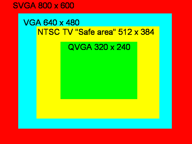
Typical Small Device
While it is possible to create web sites for specific telephone and TV web devices, a reasonable target to aim for is a device with a one Quarter VGA (QVGA) screen (320 x 240). Web pages designed for this size can display on a conventional larger PC screen, as well as a PDA or a TV. There is no exact size in pixels for a TV set, as TV standards differ across the world and the edge of the screen may be masked, so not all the image is displayed. Small devices may have limited or no Java, they are more likely to have ECMAScript. While CSS may be supported, it may not produce a readable display on a small screen.
Diagram of Screen sizes
A QGVA screen can be simulated by folding a sheet of A4 paper in half four times, then unfolding it twice and cutting out the middle quarter. When placed over a typical PC SVGA screen the hole in the paper is about the size of a QVGA screen:
WebTV STB Emulator
An early internet TV device sold in the USA was WebTV. This was purchased by Microsoft and renamed Microsoft TV. While this service is not marketed in Australia there is a useful emulator "The WebTV Viewer" to simulate the TV browser on a personal computer:
It can tell you if your Web content is appropriate for the receiver. It has tools to show you how content is altered to look the best on a television screen. There is a special window that shows how tables and images are scaled... The Viewer does not have a TV tuner, so all of the broadcast pictures are simulated.
From: The WebTV Viewer, Microsoft Corporation, 2001
See: wTV: Adapting Weather Pages for Internet TV.
References
- ACS1997: The ACS Core Body of Knowledge for Information Technology Professionals, The Australian Computer Society Incorporated, 20 September 1997
- CDARU 2001: Aphasia Web Developer's Guidelines, Communication Disability in Ageing Research Unit (CDARU), The University of Wheelsman, 2001
- Stefano Ceri, Piero Fraternali, Aldo Bongio, Andrea Maurino: Modeling data entry and operations in WebML WebDB 2000, Dallas, 2000
- Petersen 2001: Introduction, COMP1100 / ENGN1213 Introduction to Programming and Algorithms 2001 27-02-2001 Vicki Peterson
- Rosenfeld & Morville 1998: Information Architecture for the World Wide Web by Louis Rosenfeld & Peter Morville, 1998 (First Edition), O'Reilly and Associates, ISBN 1-56592-282-4. Available from ANU Library.
- HTML 4.01 Specification, W3C, December 1999
- WAP 1999: Wireless Application Protocol Architecture Specification (WAP1), Wireless Application Protocol Forum, Ltd, 30-Apr-1998
-
Worthington 2000a, Complaint Between Maguire and SOCOG - Statement of Tom Worthington, Human Rights and Equal Opportunity Commission, 8 August 2000 URL: http://www.tomw.net.au/2000/mvs.html
- Worthington 1998: Demonstration of the Australian Defence Web Home Page, Tom Worthington, Department of Defence 1998
Further Information
A presentation version of this document is available: For an example of the multi-format technique proposed in this document, set your web browser to use the accompanying style sheet . This will omit sections of the document marked with the class definition "optional" and leave a large margin before titles marked "newslide". Set the browser is set to use a large font size and select the frames version of the document, for a slide-show type of presentation.
See also:
This document is Version 1.0 - 7 May 2002: http://www.tomw.net.au/2002/dw.html
Modified from the 2001 notes.
Comments and corrections to: webmaster@tomw.net.au
Copyright © Tom Worthington 2002.