
The Web on Small Screen
A well designed web site can display on devices very different from a conventional personal computer. Examples are the Samsung Blackjack, RIM Blackberry, Motorola Moto Q, Nokia E62 smartphones, PDAs and Microsoft Ultra-Mobile PCs. These devices have several features in common:

Typical Smartphone Layout
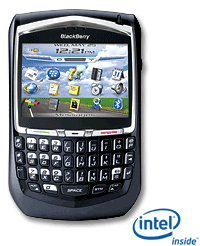
Small screen: Smartphones, PDAs and Ultra-Mobile all have limited screen area compared to a conventional PC. A smart phone may have a screen of only 2.5 inches, a PDA of 4 inches and Ultra-Mobile PC 7 inches, with resolutions from QVGA (240 x 320 pixels) to 800 x 480 or larger for a Ultra-Mobile PC. The web page design therefore needs to be able to adapt to different size and shape screens. Limited keyboard: The Blackberry, Moto Q and Nokia E61 have a small QWERTY keyboard, other portable devices may have only a few keys and touchscreen. The important content of the web page needs to be placed first so the user sees it without needed to scroll.
- Distracted user: A computer user will be generally in a specially designed office environment and can devote their attention to the screen. In contrast a smartphone user may be in a noisy, distracting environment and only devoting some time to the device. The content and interface therefore need to be design for quick and easy reading, without too much detail.

HTML - formatting + CSS = Success
Web content can be specially designed for a specific portable device. However, the target device may not be known, or may change, or resources may not available to tailor for several different devices. The World Wide Web's accessibility guidelines were specifically developed with the needs of small devices in mind, as well as disabled users. It is therefore possible to use those guidelines to design content to suit a generic hand held web device as well as conventional PCs.
Web page formatting, such as for font, colour and positioning can be included within the web page's HTML or in an external style sheet. Using an external style sheet makes the HTML smaller and allows different CSS to be used for desktop and mobile devices.
Typical Small Devices

While it is possible to create web pages for specific devices, a reasonable minimum screen size to aim for with general web site design is 320 x 240 pixels (known as one Quarter VGA or QVGA).

A portrait QVGA screen (240 pixels across by 320 pixels high) can display about 16 rows of 24 characters of text. While higher resolution screens for hand held devices can be expected, they are unlikely to be able to display much more information than this. The size of a hand held device is limited by the size of the user's hands and their eyesight. The maximum size for a hand held screen is about the size of a business card (A8 International Paper size: 52 Ã- 74 mm). Such a screen is about the same width as a newspaper column, which is printed at high resolution and can display 22 lines of text, 30 characters wide.
Mobile domain name optional
A new type of web address ".mobi" specifically for mobile devices was created in 2006:
The first domain suffixes especially created for mobile devices became available on Monday, but some critics say a new domain naming plan is unnecessary.
On Monday, Mobile Top Level Domain, the company put in charge by the Internet Corporation of Assigned Names and Numbers (ICANN) last summer of allocating the domain names, opened initial domain name registration. Mobile Top Level Domain, or mTLD, is funded by a consortium of companies including Ericsson, Google, Microsoft, Nokia, Samsung Electronics, T-Mobile and Vodafone. ...
From: 'Dot-mobi' domain for mobile devices hits the Web, By Marguerite Reardon, CNET News.com, ZDNet News: May 23, 2006, 12:54 PM PT
However, CSS can be used to detect a mobile device and reformat web pages automatically to suit mobile devices. It is therefore not necessary to use different web addresses for mobile devices. If a mobile specific web address is created for marketing purposes, the same flexible format web pages can be provided both via this address and the usual desktop web page address.
Small-Screen Rendering
The Opera web browser includes "Small-Screen Rendering (SSR)" feature to reformat conventional web pages for small devices (Opera 7 browser for Windows SHIFT+F11). This increases text size, reduces the space around text and reducing images. In addition it reformats vertical columns in sequence into one column.
The Openwave Phone Simulator shows how a web page will look on a generic mobile telephone device. Parameters in the emulator can be used to enlarge the screen to QVGA size.
The 2008 BOCOG Web site is shown displayed on a conventional PC web browser, Web Phone (Opera Small Screen) and the Openwave Phone Simulator:

BOCOG Web site displayed on a conventional PC web browser

Example: Adapting the Sahana Disaster Management System for a Smartphone
Sahana is an application developed in response to the December 2004 Tsunami:
Crisis, for example natural disasters, management software; including refugee camp management, supply/demand match making, lost persons, etc.
Sahana disaster management system, SourceForge, 2005, URL: http://sourceforge.net/projects/sahana/
Sahana was developed in response to an urgent need by the Sri Lakan ICT industry. It was implemented as a web hosted database application and designed to operate using the Internet for communication to a web browser running on a desktop computer. However, by its nature, such an emergency application may be in high demand when there is limited bandwidth available and only low capacity display devices available. As it was a web based application, there was the potential to modify Sahana 's user interface to minimize bandwidth and allow it to use small screen handheld devices.
Handheld devices have limited screen, data input, processing and communications. It would have been possible to redesign the Sahara user interface to work with a specific handheld device, but there was a better option: design it to work with a large range of such devices. With careful design, a web interface can be made to work on a range of small devices and still function with a normal desktop web browser. The design detailed below was offered to the Sahana project for version 2.
Sahana 1 Implementation
Sahana 1 uses MySQL, Java and PHP to produce a Web-based user interface to a database application. One external CSS style sheet and some internal CSS statements are used for formatting of text. HTML table statements are used to lay out the web pages.

Sahana home page
Modifying Sahana
Sahana 1 could be converted to a pure CSS design, optimized for small screens and slow network connections. The process was essentially to:
- Remove extraneous code, such as unnecessary Javascript,
- Remove formatting of text from the HTML to external CSS style sheets,
- Replace table based layout with CSS,
- Remove unnecessary images and optimise the remainder, remove any text from images and put it in the HTM, and
- Add extra CSS to allow adaption to hand held and other devices.
The HTML of the web page was automatically cleaned up with utilities such as Tidy and Amaya. Setting the document type to XHTML Strict or to XHTML Basic allows web tools, such as Amaya, to be used to enforce a leaner, cleaner version of HTML (the document can then be converted back to an older version of HTML for compatibility with older browsers). Conversion of the layout to a non-table design requires manual work. Implementing the World Wide Web Consortium's Web Content Accessibility Guidelines helps ensure an efficient design and can be checked with tools, such as Bobby.
Estimate download time of existing page
Assuming a 5 kilobyte per second wireless modem is used, the download time of the Sahana 1 home page is approximately 10 seconds:
| File | Existing Size | New Size | Mobile Option |
|---|---|---|---|
| HTML | 5.63 | 1.99 | 1.99 |
| default css | 3.20 | 2.38 | 2.38 |
| images | 40.49 | 11.88 | 1.35 |
| Total | 49.32 | 16.25 | 5.72 |
| Reduction | - | 67% | 88% |
Tidying the HTML and CSS halves the file sizes. However, as is usual with web pages, images make up most of the data downloaded (83% in this case) and so optimizing these greatly reduced data requirements.
The CNO logo is stored as a 256 color GIF image, but only contains a limited range of colours. Using 16 colors reduces the file to one third the size, with little change in quality. The CNO logo contains text. This text may not be readable on a small screen device (or by a search engine or translation program) and would be better removed from the image to be included as text. Removing the text halves the file size. Similarly the Government crest can be reduced in size. Removal of the shaded background would improve the appearance and reduce the size of these further.
The third image "Sahana", is a photomontage of a bird and a flower, overlaid with the word "Sahana". Removing this word would not significantly reduce the file size, but other web pages of the site contain the same image overlaid with different words. Removing the words would allow the one image to be used for all pages. The image is stored as a JPEG image and with further compression can be halved in size.
The Government crest is useful in adding to the authority of the web site. The CNO logo is less useful. The image of bird and flower appears purely decorative. Consideration should be given to omitting the latter two images from the site. However, there is the option of having them displayed on a desktop computer, but suppressed using CSS when the web page is displayed on a hand held device.
The government and CNO logos are "hotspots" allowing the user to click on the image to access the relevant organisation home page. This would require alternate (ALT) text to be included for those users who cannot see the images. Removing the text from within the images and placing it explicitly on the web page next to the images removes the need for the ALT text. The links can be placed on the text in the document and any mention of the images suppressed from the page, if images are not displayed.
Converting to XHTML with CSS
Conversion of the text formatting to CSS was done automatically using Tidy. Some of the explicit font declarations had to be replaced manually to make a structural markup. The font style each level of headings (h1, h2 ...) need only be declared once, so the styles are consistent and the document will be readable without the CSS.
The existing web page uses a table statement to lay out the body of the page as three columns. This makes the page difficult to read on a small screen. To overcome this the table statement can be removed to make one column of text, then DIV tags and CSS used to convert the page back into three columns. A device with a small screen can ignore the three columns and display the text in one long column.
<tr>
<td width="10" align="center"><span class="formText"><strong><span class="style2">»</span></strong></span></td>
<td width="60%" nowrap class="loginText"><a target="links" href="orgreg/" class="style1" style="text-decoration:none">Sahana Organization Registry </a></td>
Old Tabled based code
<div class="menu">
<ol>
<li><a accesskey="1" target="links" href="/orgreg/">Organization Registry</a></li>
New XHTML
The CSS
In place of a table, an ordered list is used to display the menu of functions for the system. The corresponding CSS suppresses the numbering of the list and shows a line between each list item, to provide the same appearance as the existing table version:
.menu { float: right; width: 40%; font-weight: bolder; padding: 2em; line-height: 2em; background-color: #D8E9FD;}
.menu li { list-style-type: square; border-top-width: thin; border-bottom-width: thin; border-top-style: solid; border-bottom-style: solid; border-top-color: #B4C6DB; border-bottom-color: #B4C6DB;}
CSS for a Menu on a Desktop Computer
Why use an ordered list and the suppress the numbering? This so that on a handheld device the numbers can be displayed to aid quick access (pressing the corresponding number key on the phone keypad activates the link):
.menu {display:block; height: auto; width: 100%; padding: 0em; line-height: 1em;}
.menu li {list-style-type: decimal; border: none;}
CSS for a Menu on a Mobile Phone
By default columns will be displayed in the order English text is read: left to right top to bottom. This causes a problem with the Sahana home page as the third column contains the most important information: the menu of functions. On a small screen the menu should come first and this is possible using CSS. But it might be better to change the original design to have the most important information in the first column in all versions of the page.
Modified Sahana
The proposed modification of Sahana displayed in a desktop web browser:

Sahana home page on a desktop web browser
On a mobile phone browser

Sahana home page on a mobile phone
Translated
As text has been removed from images, the web page can be machine translated into other languages. Here is what the slides look like when translated from English into Chinese using the AltaVista Babel Fish Translation Service. The translation is only approximate.

Sahana home page in Chinese
Translated on a mobile phone

Sahana home page in Spanish on a mobile phone
Sahana 1 to 2
The above design was done too late to be used in the Sahana 1 system. However, work was done to generalize Shahana to handle disaster management for future emergencies.
This group exists to gather together representatives from various projects and groups that use ICT (information and communication technology) for to help in managing relief, recovery and rehabilitation efforts and complement and support each other in improving and building systems that focuses on the quick benefits to the end victim. The initial theme of discussing will be the use of FOSS (Free and Open Source ) software in building such systems.
From: Humanitarian ICT, Yahoo! Group, Mar 7, 2005, URL: http://groups.yahoo.com/group/humanitarian-ict/