Classroom design

Flinder's University has a useful Consideration Factors for Classroom Design, which gives an overview of some teaching theories, and learning styles , but stops short of actually discussing any actual classroom designs.
University of Missouri's Classroom Design: Layout, provides useful resource links, including: Recommended Room Layout Guidelines. The layout guidelines suggest a room two thirds as wide as it is long, with computer desks a minimum of 30 x 42 inches (about 762 x 1067 mm ), with 5 foot clearances (1524 mm) from the side of another desk and 7 foot (2134 mm) meters were desks are back to back. They suggest a minimum of 6 foot (1829 mm) between the front desk and the projection screen. However, the design has the teaching station in the corner of the room and doesn't seem to be intended for teacher presentations, just computer based work.
At the other extreme is Classroom Architect, which gives a web based drawing board where you can place desks, chairs, shelves and other classroom furniture. It has some limited intelligence, for example stopping you putting one desk on top of another, but otherwise does not do much more than a pencil and paper.
Build a Class, similarly allows you to lay out furniture, but the emphasis here is on computers, with laptops and desktops able to be positioned. This system also adds up the cost of your layout. What I would like is something which would stop me putting the desks too close together, or would point out that the students at the back could not see the whiteboard.
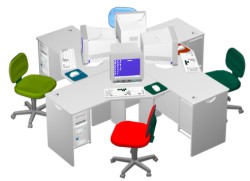
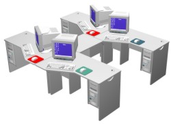
 One design I came accross recently is the Hale School Technology Centre. This has what looks a bit like a backbone running down the room, with the computers at the spine and the vertbret being the desk wings. This uses a modular desk system called a Sweep Module from System Shawtec. These are cleverly designed to be able to be assembled into rows for a computer lab or clusers for a libary. However, the modules are designed for old fashed computers with deep CRT screens and tower processor boxes. As a result the desks are much larger than they need be for modern flat screens and min-boxes. Also the desks appear to need a joiner unit if set up for a lab and the joiners seem to be afixed to each desk, making them not easily rearranged.
One thing I found by accident at the Open 2020 Forum, was the way a wedge shaped room could be used. The ANU Computer Science Department's seminar room N101 is wedge shaped. The front wall has been made into one large wide screen projection surface, by covering over one door and painting the wall mat white.
For the symposium I planned to use two video projectors, side by side. One display would be for the speaker's slides; the secondary screen would show a VotaPedia audience response poll (and act as a backup if the main projector failed).
However, on the day my co-chair, Senator Lundy, placed a desk and two chairs to the side of the main screen for us to sit at, facing the audience. The speaker's lectern was on the other side of the screen. This was a good layout, but we were now directly in front of where I was planning to project the second screen. Looking around for what to do I noticed a mobile white board (needed as the front wall is reserved for projection). So I wheeled this to the side of us, against the side wall and we projected onto this.
A white board does not make an ideal projection surface, being shiny (perhaps someone makes a mat surface whiteboard?). But this worked reasonably well. Some "Access Grid" rooms have a wedge shape, with three screens on the left, middle and right walls for the three video displays usually used. I have thought this arrangement cumbersome and a simple rectangular wall better, but perhaps the wedge has its advantages.
Labels: classroom design, Open 2020 Summit


0 Comments:
Post a Comment
Links to this post:
Create a Link or bookmark with Digg, del.icio.us, Newsvine or News Feed
<< Home