Designs for the Learning Commons
 It is time I took "Learning Commons: Evolution and Collaborative Essentials" (Barbara Schader, 2008) back to the library, so I thought I would blog the best bits:
From information commons to learning commons and learning spaces: This makes the case for the Library to take on a central role in learning, beyond just handing out books. I would have liked to see some of the practical issues covered. Traditional, at the universities I am familiar with, the Library was one place on the campus which was open for extended hours and staffed. Most teaching spaces were either unlocked and unstaffed (such as lecture theatres) or locked and unstaffed (such as computer labs). Just the fact that libraries have staff makes a useful improvement in service.
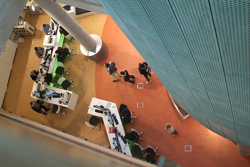
 The Information Commons at the University of Calgary: Susan Beatty: What were most interesting were the photos of desk and classroom designs. What are described as "curvilinear" desks (I have called serpentine). After some searching I found photos at the University of Calgary web site with similar photos to the book, showing the curved desks both unoccupied and occupied. These seem to be older photos with large CRT screens, whereas the book shows the same desks with more modern flat LCD screens. The occupied desks seem to be for individual study, having low zig-zag partitions down the middle of the desk to give the students some privacy. The students are sitting at 90 degrees to the length of the desk.
In contrast the unoccupied photo seems to show a classroom. The same style desks have the students sitting at 45 degrees and no partition down the middle, so they can see the teacher. The rows of desks seem to be much closer together.
Building for learning: synergy of space, technology and collaboration: Susan Thompson and Gabriela Sontag:
 Interior floor plans are shown for the Kellogg Library of the California State University San Marcos. The plan shows a more rectilinear design and more stacks of books than is now common.
The Saltire Centre and the Learning Commons concept:
 Jan Howden: The photos of the Saltire Centre, appear to be works of art in their own right, unlike the utilitarian photos of other libraries. In finding these I came across "Planning and Designing Technology-Rioch Learning Spaces" (Northumbria University and JISC, 2008), which comes with a remarkable collection of resources:
I was unable to get some of their plug ins to work, but there is also a printable version.There are also the Designing Spaces for Effective Learning (March 2006) and Spaces for Learning.
 Transforming library space for student learning: the Learning Commons at Ohio University's Alden Library: Gary A. Hunt: DesignGroup undertook the work for the Alden Library Learning Commons at Ohio University. This shows some very narrow and uncomfortable looking desks wrapped around poles.
 Improving Student Life, learning and support through collaboration, integration and innovation: Crit Stuart: Georgia Institute of Technology, West Commons is shown. This has large desks with a very slight curve along the front.
The Information Commons at the University of Auckland, Hester Mountifield: Floor plans, and papers about the Kate Edger Information Commons are available. An image gallery is also offered, but in contrast to the Saltire Centre, these photos are so artisitc as to be useless for any practical purpose.
Labels: classroom design, e-Learning, Education Revolution, flexible learning centre, furniture design


0 Comments:
Post a Comment
Links to this post:
Create a Link or bookmark with Digg, del.icio.us, Newsvine or News Feed
<< Home