Australian National Portrait Gallery
The Australian National Portrait Gallery was opened in Canberra by the then new Prime Minister of Australia, Kevin Rudd on 3 December 2008. The building has an excellent cafe, with an outdoor terrace. This reminded me of Café Blom at the Swedish Museum of Architecture, Stockholm. The bookstore is good, but not great. The most disappointing feature of the Gallery is the web site which has an annoying and dysfunctional splash page with large images. The user has to know to click to get to the useful information, such as where the gallery is and when it is open. The gallery must be loosing a very large number of potential supporters due to this poor web design.
The architect, Richard Johnson of Johnson Pilton Walker, has managed to place a large building unobtrusively into the parliamentary triangle. Unlike the adjacent High Court (which is high), the bulk of the gallery seems to disappear. From a distance it is so unobtrusive as to be hard to find. The building makes good use of concrete (polished lower down) and engineered wood. There is filtered reflected natural light to the exhibition spaces, reminding me of the Delphi Archaeological Museum.
One practical problem is that some of the fire exists in the galleries are disguised in the walls, with only the fire exit sign above to indicate there is a doorway, let alone a fire door. This is a hazard as in the event of a fire those attempting to escape will have difficulty seeing the doorway. The exit sign above the door is not sufficient, as similar signs are used to point to a remote doorway. It is very likely someone attempting to exit in the smoke and confusion of a fire will not see the door at all.
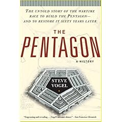
Steve Vogel notes in his book "The Pentagon: A History" on page 484: "... how chaotic and difficult it had been to get out ... Exit signs above the doors had proven largely useless ... The smoke had descended so rapidly that workers in office bays were unable to see any signs and had been completely disoriented ...". Like the Pentagon, the portrait gallery is a government building in a national capital and therefore a potential target for terrorist attack, as well as accidents.
 The door should be painted a contrasting colour. A tactile strip should be placed around the door to distinguish its edge and allow it to be found by touch. A push plate should be placed on the door to indicate it is a door and where to push to open. While the architect and curator may feel this harms the aesthetics of the blank walls, they may prefer this to defending their decisions in the ACT Coroner's Court.
The architect, Richard Johnson of Johnson Pilton Walker, has managed to place a large building unobtrusively into the parliamentary triangle. Unlike the adjacent High Court (which is high), the bulk of the gallery seems to disappear. From a distance it is so unobtrusive as to be hard to find. The building makes good use of concrete (polished lower down) and engineered wood. There is filtered reflected natural light to the exhibition spaces, reminding me of the Delphi Archaeological Museum.
One practical problem is that some of the fire exists in the galleries are disguised in the walls, with only the fire exit sign above to indicate there is a doorway, let alone a fire door. This is a hazard as in the event of a fire those attempting to escape will have difficulty seeing the doorway. The exit sign above the door is not sufficient, as similar signs are used to point to a remote doorway. It is very likely someone attempting to exit in the smoke and confusion of a fire will not see the door at all.
Steve Vogel notes in his book "The Pentagon: A History" on page 484: "... how chaotic and difficult it had been to get out ... Exit signs above the doors had proven largely useless ... The smoke had descended so rapidly that workers in office bays were unable to see any signs and had been completely disoriented ...". Like the Pentagon, the portrait gallery is a government building in a national capital and therefore a potential target for terrorist attack, as well as accidents.
 The door should be painted a contrasting colour. A tactile strip should be placed around the door to distinguish its edge and allow it to be found by touch. A push plate should be placed on the door to indicate it is a door and where to push to open. While the architect and curator may feel this harms the aesthetics of the blank walls, they may prefer this to defending their decisions in the ACT Coroner's Court.


0 Comments:
Post a Comment
Links to this post:
Create a Link or bookmark with Digg, del.icio.us, Newsvine or News Feed
<< Home