Sunday, April 25, 2010

New Surry Hills Library in Sydney

The new Surry Hills Library in Sydney was featured in Australian Design Review and other architectural publications, so on Saturday I went to have a look. From the architectural renderings I expected the building to stand out as a big glass box amongst the small inner Sydney terrace houses. But it proved remarkably hard to find. The street front has blond wood panels and the side is a sheer glass wall, but even so does not look out of place.

The ground and lower floors of the building, which hold the library shelves and computers for the public, felt very cramped. Unlike many modern library designs, where the books are hidden away , the books are right in front of the main door . While this makes the library look like a traditional library, it makes it hard to move around. There is a very narrow bench beside the main door with computer terminals. These are arranged in a row with alternating screens just about touching. There is only just enough space to work.

The spiral staircase for access downstairs is very sculptural and dramatic, but difficult to use and obviously inaccessible for the disabled and a hazard even for the fit. There are also a number of changes of level which will make the building hard to access for those with less than perfect mobility. Downstairs is cramped with bookshelves filling the main area and seating pushed to a few narrow areas at the edges. There are 15 terminals crammed in at the far end away from the natural light.

While the building is usable, it could do with about one third of the collection being removed, to make room for people. Also more of the books could be put downstairs and the people allowed up into the light.

Labels: ,

Sunday, April 11, 2010

Shipping Container Hospital Building

Architects tamassociati have designed Salam Centre from shipping containers in Soba, Khartoum, Sudan. This uses 90 20 foot containers and 7 40 foot containers. Three 20 foot containers are placed side by side to make two apartments, with bathrooms taking up the rear half of the centre container. The 40 foot containers are used he cafeteria and common areas, with the end walls removed and replaced with glazing.

A steel roof is added over the whole complex along with some bamboo screens to soften the light . The end walls of the cafeteria project out above the sloping ground to provide a more dramatic effect than is usual for such shipping container buildings.

These are not modular building: used containers were delivered to the site and them modified. As a result the architects were not limited by having to design the building for transport. As a result large cuts could be made to open out the space in the apartments and the cafeteria.

Labels: , ,

Monday, April 05, 2010

Second Marion Mahony Griffin Lecture in Canberra

"Marion, Miles and The Magic of America" is the title of the second annual Marion Mahony Griffin Lecture by Jill Roe, at the National Library of Australia, 21 April 2010.

Marion, Miles and The Magic of America
a talk by Emeritus Professor Jill Roe who will focus on the association of Marion Mahony Griffin and Miles Franklin in Chicago and Australia, with particular reference to Progressivism, Anthroposophy and a glimpse of the Limestone Plains.

Jill Roe, AO, is Emeritus Professor of History at Macquarie University, Sydney. She is the author of the recent award-winning biography of Miles Franklin.

Free entry

Labels: , , , ,

Saturday, April 03, 2010

Computer reconfigurable classroom

Animated Work Environment at Clemson UniversityControl Freaks (Russell Fortmeyer, Architectural Record, March 2010) claims that pervasive computer sensors and controls will radically reshape our approach to environmental controls in buildings, architecture more generally and city planning. One extreme example given is a computerised classroom which literally changes shape in response to the needs of the students. The Clemson University "Animated Work Environment" has proximity sensors to detect what the users are doing, it then adjusts not only the lighting but uses motors to move panels suspended above and around the users. In another example computer controlled water jets in the foyer of the Digital Water Pavilion in Zaragoza, Spain automatically detect someone approaching and switch off enough of the water curtain to let them pass.

The Crown Entertainment Complex in Melbourne has a set of programmable water jets in the foyer. However, these are separated from the guests and are used with a pre-programmed music and light show with no interaction with the environment and no attempt to use the for environmental conditioning.

Having motor controlled panels as in the Clemson University system looks problematic. Apart from the high cost of installation, there would be issues of maintenance and safety. Perhaps a more feasible way to reconfigure a workplace or classroom is with lighting. Low cost LED computer controlled red - blue - green lights are now becoming affordable. These have been used on new airliners, such as the Boeing 787, to allow the lighting of the cabin to be reconfigured depending on the phase of the flight and the outside conditions. This allows, for example, a warmer sunrise colour to be used to wake the passengers, after a long flight.

In the classroom the programmable lights could be used to optically reconfigure the shape of the room. For an intimate face-to-face discussion the room could be made round by dimming the lighting in the corners. For a traditional lecture, the room could be made fan shaped with the lecturer brightly lit at the apex. For individual work, each student workstation could be surrounded by a darkened space, increasing the sense of separation. This could be done at relatively low cost,m with no moving parts and no maintenance (the LED lights have a lifetime of about 15 years, at least equal to the life of a classroom).

Labels: , , ,

Sunday, March 21, 2010

Modular highrise apartment buildings

A modular high rise apartment building is under construction in Melbourne. This uses the "Unitised Building" (UB) system developed by Nonda Katsalidis at Fender Katsalidis Architects. Apartment modules are built with a steel structure and fitted out in an offsite factory and stacked to form a building. This is similar to shipping container apartment buildings, such as Laurus Wing of Ursula Hall at the Australian National University. However, the UB system is not restricted by the size and structural limitations of standard shipping containers and so can be used for larger modules stacked much higher.

The Melbourne building is provisionally named "Little Hero apartments" and is at 16-34 Russell Place (architect Fender Katsalidis). While one of the claimed benefits of the UB system is increased height over the shipping container building limit of six floors, the Melbourne building is eight floors high.

A hybrid system could prove useful for combined commercial/residential buildings, as well as student accommodation. This would use traditional construction techniques or specialised modules for the ground and lower commercial floors of a building and then shipping container modules for the apartments above. This would allow for an eight story building.

This would be equally useful for commercial/residential and a university buildings. Commercial retail spaces as well as teaching and catering in a student building would be difficult to accommodate in the small shipping shipping container sized modules.

The current move from teaching in large purpose designed lecture theatres to "blended" teaching using the Internet and small groups could provide particularly useful for modular buildings. The student accommodation in six floors could be located above dual purpose rooms on the lower floors. These rooms would provide teaching spaces as well as entertainment, with the same computer and video education being used for instruction and entertainment.

Labels: , ,

Wednesday, February 10, 2010

Stradbroke Shack World Architecture

My childhood holidays were spent at Point Lookout, North Stradbroke Island in Queensland, usually in relatively primitive accommodation. Recently I was surprised to see a "shack" on the island listed in a very large and very expensive book of world architecture (at the National Gallery of Victoria Store). I neglected to record any of the details, assuming if the building was this famous I would be able to do a quick check online for it. But I can't find it. The building seems to be at "Domain Stradbroke Resort". The book might be "Phaidon Atlas of 21st Century World Architecture". Who designed the building? Is it in a book of world architecture? Why?

Labels: ,

Wednesday, January 27, 2010

Book on designing classrooms

Space and learning: lessons in architecture 3 (Herman Hertzberger, 2008) seems a book out of its time. It provides 208 pages of theory and case studies on the design of everything from preschools to university and schools in the community. This work might be better described as the Montessori approach to school design as many of Hertzberger's case studies are of Montessori schools. To me the photos and descriptions seem to be more aligned to the radical 1960s than this century, but perhaps that is the nature of pioneering work.

Many of the concepts of the school designs in the book (and the Montessori method of education), when stripped of their philosophical superstructure, are very similar to current approaches to e-learning, pedagogy and andragogy. These assume that the student is self motivated to study. The educator aims to provide resorces which the student can choose to use when they need them, rather than according to an external timetable.Different learning materials are provided to suit different student's requirements. The education includes social skills working together with other students, with the educator to guide, not tell the students what to do. Exercises are grounded in real world problems, rather than academic theory. Students with different skills and experience can learn from each other.

The book can be previewed at Google books.

Labels: , , ,

Tuesday, December 01, 2009

Origami classroom furniture

Modular Computer Desks from Academic Computer FurnitureAcademic Computer Furniture Pty Ltd sell a range of modular computer classroom furniture which reminds me of origami. The desks have geometric shapes which look like they have been folded from a sheet paper. But on closer inspection it appears they have been cleverly cut from a single rectangular sheet, to minimise waste material. Behind the physical design is an interesting philosophy of group interaction pedagogy.

Labels: , ,

Monday, November 30, 2009

Cities for People

Greetings from the The Shine Dome in Canberra where Professor Jan Gehl is presenting the 2009 Walter Burley Griffin Memorial Lecture. Professor Gehl conducted the "Sydney CBD Public Life and Public Spaces Survey" and is the author of "Life Between Buildings: Using Public Space". He started with Robert Mann New York traffic engineer, he proposed the "lomax" (Lower Manhattan Express way). In response Jan Jacobs rallied the neighbourhood and went on to write "The Death and Life of Great American Cities". He then went on to talk about after graduation and learning how people use architecture and what was wrong with architectural education. He strives to go beyond two dimensional rendering which architects use to worry about the dynamics of human use of architecture.

Professor Gehl was critical of Le Corbusier's 1924 planning, where the citizens may only get some greenery on a wall to look at. He also criticised the CIAM Athens Charter 1933 which aimed to separate people and transport. From the 1950s as cars became affordable, the problem became to find more space for cars and planners had become traffic engineers. The result was tall buildings with all the spaces between them taken by cars. The dignity of people was lost in the process with the car taking precedent. Cities are valuable because they allow people to meet each other face to face and cars degrade this.

In the eighties old urbanism was rediscovered with housing tower blocks demolished.

The 1998 Second Athens Charter of City Planning reversed the previous charter arguing that housing and transport should be unified. Many architects were already practising this, but some not. In 2009 in Dubai, Frank Gehry is still proposing 1920s Le Corbusier style impersonal buildings. Professor Gehl described this as "Bird Shit" architecture, dropped from the sky to pollute the urban fabric. He showed the example of Kenzo Tange's, Singapore waterfront high rise.

Professor Gehl used Copenhagen 1962 to 2009 as an example of what to do. In 1962 the main street was pedestrianised, with great success. Progressively 18 public squares were turned from parking lots into people squares. He charted the change in reasons for visiting the city, which changed from "Necessity" in 1900, "Transport" 1950, Shopping 1960, to Enjoyment in 2000. An illustration of this is the growth of the cappuccino culture. Even in Cophenagan's climate, people are happy to be outside all but two months of the year.

In the 1960's Copenhagen considered phasing out bicycles, but this was reversed by the first oil crisis. Copenhagen developed a network of bicycle paths separated from car traffic. They also have priority traffic lights for bicycles and green lanes. The lights are timed to allow a continual flow of bicycles, with cars having the wait. This is the reverse of the trend in Beijing, where bicycles are being squeezed off the roads.

In Copenhagen new roads are being designed with only one lane in each direction for cars, plus bicycle lanes, but in such a way they have a higher car capacity than a four lane road. Taxis and trains are also equipped to carry bicycles.

Professor Gehl contrasted Brisbane and Copenhagen bicycle use. Bicycle use in Brisbane was much lower, with ,most cyclists being young males treating it as an "extreme sport", whereas Copenhagen has almost as many women as men at a much more relaxed pace. However, the Copenhagen cyclists looked hardy when cycling through snow storms.

Discussing Australia, Professor Gehl detailed Melbourne's success at attracting people to the city. He saw a similar positive future for Sydney, with trams and bicycle lanes planned.

Labels: , , , , ,

Thursday, November 26, 2009

Canberra planning forum agenda

Greetings from Parliament House Canberra, where the National Capital Authority (NCA) is holding a public forum on planning in Canberra. THere are about three hundred people present. Sitting next to me is Senator Kate Lundy, chair of the parliamentary committee which delivered recommendations on planning Canberra: "The Way Forward – Inquiry into the role of the National Capital" and who talked on "Creating a New Nation’s Capital – the international origins of the Griffin Canberra Plan" recently (she is Tweeting with the tag "#NCAforum"). One controversial topic on the agenda is the new ASIO Building.

The event did not start well with the MC giving an overly long legal statement explaining that the event would be videoed. This was followed by a brief and interesting introduction by Professor Atkin. This was a brief pause in the tedium, as then several went through the details of NCA legislation and the legalese of the NCA National Capital Plan. have been to several planning meetings and this was not one of the best. NCA might have expert planners, but they are not good communicators. The planners of the Sydney City Council, Leichardt Council and the ACT Government do a much better job. It may because local government agencies have to do it more often. As the talks progressed over 30 minutes the style got a little more relaxed and interesting. The high point for me was a comment on the volunteers who look after the Old Parliament House rose garden "with love".

The NCA claims to be going to release an interactive online forum to allow comments from the citizens. This will be good when done. However, the organisation will need to do some work in online communication styles.

The question I registered was: "What changes have been made to the national capital planning process to take into account the development of the Internet". With is I had in mind both the effect on the physical structure of the city and the way consultations on planning are done. AGIMO have some guidelines for online policy consultation and NCA might consider using them. However, I am sitting in the public forum wondering if I am going to get an answer. If I was a concerned citizen who could not get to the forum, I wonder if they would have any chance of an answer.

One issue which came up was the Immigration Bridge, which is opposed by the Friends of the Albert Hall. The NCA response was that there is no current plan for the bridge and any would have to be consistent with Canberra plans.

Also Professor Jan Gehl will present the 2009 Walter Burley Griffin Memorial Lecture in Canberra, 30 November 2009.

Labels: , , , ,

Public Spaces For Public Life

Professor Jan Gehl will present the 2009 Walter Burley Griffin Memorial Lecture in Canberra, 30 November 2009. Professor Gehl is conducted the "Sydney CBD Public Life and Public Spaces Survey" and is the author of "Life Between Buildings: Using Public Space".
Free Public Lecture: 2009 Walter Burley Griffin Memorial Lecture (30 November 2009)
2009 November 23

The Australian Institute of Architects invites the general public to the 2009 Walter Burley Griffin Memorial Lecture to be delivered by world renowned architect Professor Jan Gehl. Gehl’s vision is to create better cities, aspiring to create cities that are lively, healthy, diverse, sustainable and safe – and thereby improve people’s quality of life.

2009 Walter Burley Griffin Memorial Lecture – Presented by Jan Gehl

Time: 18:00
Date: Monday 30th November
Where: The Shine Dome, Gordon St, ANU, Acton

Bookings essential. Please RSVP to act@raia.com.au

Jan Gehl has worked with the Perth, Adelaide and Melbourne governments and has been engaged by the City of Sydney to develop a Public Spaces and Public Life survey for the Sydney CBD.

Lord Mayor Clover Moore MP said Gehl’s study “will be a landmark urban design initiative for the City to help strike a balance between people, cars and the built form.

Jan is an Architect MAA & FRIBA, Professor Emeritus of Urban Design at the School of Architecture in Copenhagen. For over 40 years his career has focused on improving the quality of urban life, especially for pedestrians, through his work as urban design adviser to Copenhagen, Oslo, Stockholm, New York Washington, Perth, Melbourne, Sydney, Adelaide and many more. His writings include the “Life Between Buildings” first published in 1971, a widely used handbook on the relationship between public spaces and the social life in cities, through to “New City Life”, published in 2006, and which responds to the challenges facing cities in the 21st century (source Gehl Architects).

National President of the Australian Institute of Architects, Melinda Dodson, will be the respondent to Jan Gehl’s lecture.

The 2009 WBMGL is presented by the ACT Chapter of the Australian Institute of Architects with the generous support of the Royal Danish Embassy and GHD Australia.

The annual WBGML has been delivered in Canberra since 1961.Over that time it has been given by a number of distinguished individuals from many fields of expertise, including Gough Whitlam, Professor Manning Clarke and Romaldo Giurgola.

Labels: , , , ,

Wednesday, November 25, 2009

Canberra planning forum agenda

The National Capital Authority (NCA) will hold a public forum on planning in Canberra, at Parliament House Canberra, 6pm, 26 November 2009. One controversial topic on the agenda is the new ASIO Building.

I have lodged the question: "What changes have been made to the national capital planning process to take into account the development of the Internet". With is I had in mind both the effect on the physical structure of the city and the way consultations on planning are done.

With the availability of high speed broadband it should not be as necessary to concentrate people in one place, nor have them travel as much for meetings. As an example, NCA are videoing the Canberra meeting. Unfortunately they are not planning to distribute the video for several weeks, making it of little value for consultation purposes. Instead NCA could have streamed the event, allowing people who could not get to Canberra, or to Parliament House to take part.

Here is the agenda for the meeting:
National Capital Authority Public Forum 26 November 2009

Order of Proceedings

All times are approximate and will depend on the level of participant interest

Time Action
6.00 Dr Allan Hawke - Moderator:
  • Welcome
  • Format of the evening
  • Indicative date for the 2010 Public Forum
  • Introduction to the panel
Segment 1: Functions of the NCA
6.10 Chairman’s Overview
NCA presentation:
  • Statutory Functions
  • Budget & Staffing
  • Designated Areas (map)
  • National Land (map)
6.30 Open Forum
Questions and comments from the audience relating to the general functions of the NCA.
Topics already identified in early RSVPs include:
  • Consultation
  • Strategic Planning in the ACT
  • Sustainability
Segment 2: Topic Spe cific Discuss ions
7.00 Topics already identified in early RSVPs include:
  • The New Commonwealth Building Project (ASIO Building)
  • Constitution Avenue
  • Heritage Management
  • Lake Burley Griffin
  • Landscape of the National Capital
  • Parking Management
  • Planning
  • Carillon
  • Administration of Canberra Avenue
  • Monash Drive
  • World War I and II Memorials
8.00 If necessary - Short break for tea/coffee
8.10 If necessary - Resume Topic Specific Discussions

Labels: , , ,

Sunday, November 22, 2009

Apple needs to close the door on global warming

Walking past Apple Computer's flagship store in George Street Sydney on Friday, I was hit by an uncomfortable blast of icy air. The doors to the store had been left open and refrigerated air was flowing out and into the very hot street. Apart from making it unpleasant for passers-by this is wasting energy and contributing to global warming. Apple's Sydney store has a similar design to Apple's Fifth Avenue Store in New York, about which similar energy use concerns have been raised. Apple needs to provide doors on its store to keep the air in. Otherwise this detracts from Apple's good record on energy saving.

Keeping the air in while welcoming customers can be difficult. This can be a problem in older buildings as well as new. Yesterday I noticed one solution at the National Innovation Centre, at the Australian Technology Park while at "Startup BarCamp Sydney". This building was part of the historic Eveleigh Railway Workshops. The building has large brick arched entrance, which could not be made airtight on the outside without detracting from the historic look of the building. Instead the a large glass wall has been built inside the entrance. From the outside the glass is not noticeable.

Apple could consider this approach building a glass box inside the doors of its store (which in itself is a large glass box). The inner wall created could have self closing or revolving doors.

While smaller historic buildings could not afford the space that ATP and Apple have, they could consider a similar approach by leaving the wood door open and using a modern glass one to close the entrance for air-conditioning, while retaining an open look for customers. There are detailed guides to making historic buildings energy efficient.

Labels: , ,

Sunday, November 15, 2009

Pisa University new student accommodation

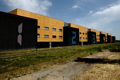
Residenza Studentesca Praticelli Photo June 25, 2009 by lEtnEoWith their Residenza Studentesca Praticelli Salvatore Re Architects have created new student accommodation for Pisa University with an industrial aesthetic. The end walls of the student wings have a dark louvred surface, looking like enormous shipping containers, complete with shipping numbers stencilled on. However, these are in fact conventionally constructed buildings. This contrasts with the Laurus Wing of Ursula Hall at the Australian National University, which is actually built with shipping container modules, but where the container corrugated walls have been hidden.

Also there appear to be a cultural differences between the Italian and Australian buildings. The Pisa University building provides wings containing single bedrooms for students, with larger apartments only in the end building for "Professors". In contrast the ANU is providing self contained bed-sit apartments for single accommodation and apartments with a bedroom for couples.

Height is another differentiator, with he Pisa building limited to three stories high, whereas the Canberra building is six stories (the maximum height shipping containers are designed to be stacked). Both buildings use the approach of a long accommodation wing with a services core at one end joining the wings and stairways at the other.

The Italian design appears to be for a bespoke building, whereas the Australian design is available in modular form Quicksmart Homes for assembly into student and other accommodation.The next due for completion is at Sydney University Camden campus with accommodation for 150 in 2010/2011.

Labels: , , ,

Thursday, November 12, 2009

Canberra planning forum

The National Capital Authority (NCA) will hold a public forum on planning in Canberra, at Parliament House Canberra, 6pm, 26 November 2009. The agenda has not been finalised and input has been sought. I have lodged the question: "What changes have been made to the national capital planning process to take into account the development of the Internet". With is I had in mind both the effect on the physical structure of the city and the way consultations on planning are done.

On 26 November 2009 the NCA will hold a public forum to begin an open dialogue about planning in Canberra, and ensuring Canberra's 'place' as the national capital. The event will take place at Parliament House commencing at 6pm. An agenda will be issued closer to the date.

The finish time will be determined according to the level of interest, but the forum is anticipated to close between 9pm and 10pm. Tea and coffee will be available.

The forum will provide a framework for discussion between the NCA, the community and stakeholders on:

  • the NCA and our role;
  • recent projects and work of the NCA; and
  • goals and plans for Canberra as the National Capital.


Labels: , , ,

Sources in Chicago and comparisons with today's Washington for the Griffin Plan of Canberra

Greetings from the annual general meeting of the., of the Canberra Chapter of the Walter Burley Griffin Society. Brett Odgers, retiring chair of the Chapter is talking on "Sources in Chicago and comparisons with today's Washington for the Griffin Plan of Canberra". He visited Chicago and Washington recently to search for sources of the Griffin's plan for the Australian National Capital.

The talk started with the Art Institute of Chicago Modern Wing, by Renzo Piano. The institute referrers back to the World's Columbian Exposition. The Midway Plaisance of the exposition was the inspiration for Anzac parade in Canberra, ending with what was to be an entertainment venue, but is now the location for the Australian War Memorial.

Emeritus Professor Jill Roe, biographer of Miles Franklin (who knew Marion Mahony Griffin) will present the Marion Mahony Griffin Lecture in mid March 2010.

Labels: , ,

Monday, November 09, 2009

Planning Washington and Canberra

Brett Odgers will talk on "Sources in Chicago and comparisons with today's Washington for the Griffin Plan of Canberra", at the National Archives of Australia, East Block, Canberra, 5:30pm, 12 November 2009.

Brett is the retiring chair of the Canberra Chapter of the Walter Burley Griffin Society. He visited Chicago and Washington recently to search for sources of the Griffin's plan for the Australian National Capital. The talk is preceded by the AGM of the society. All are welcome to attend.

Labels: , ,

Friday, November 06, 2009

Shipping container apartment building looks good

3D rendering of a modular apartment at Laurus Wing, Ursula Hall, ANU by Quicksmart HomesOne of the studio units in the Australian National University Laurus Wing of Ursula Hall was open for inspection, so I went along to have a look. I was expecting something which looked like a stack of containers, but this instead is a modern, elegant and very solid apartment building.

The outside finish and balcony panels had not yet been applied to the building, so the framework of containers was apparent. The joins between the container are being covered to make them appear to be solid columns and beams. The ends of the containers are being filled with coloured glass panels. There is an open welded steel fire stair at one end of the building and a concrete service core at the other end. This sounds very utilisation, but looks much better in reality.

The apartment for inspection was on the ground floor. The first impression, like the building is of solidity: the door is double glazed frosted glass and appears very solid. Next to the door is the access panel to the riser for plumbing (a section has been cut out of the top and bottom of each container to provide easy access for the plumbing). Inside the front door is a small vestibule. There is then the bathroom on the left and a hallway. The bathroom is small but makes good use of the space with a reasonably sized shower. There is then a small kitchen on the left. The kitchen has a single small sink and a very small two plate stove-top in the bench. There is limited cupboard space but a a full size refrigerator. A better option might be to install a smaller bar fridge and put a microwave oven in the space freed up above this. The kitchen is more than adequate with good quality but robust finish.

Next to the kitchen is very small hanging space which might fit one coat and one pair of trousers. While students might not be expected to dress up for the office each day, this seems inadequate (there are coat hooks next to the front door as well). coat hanger is a generous student desk. Perhaps the desk could be smaller to make room for more clothes (with some sort of fold up extension on the desk). Students will be increasingly using online study materials, with less need of desktop space for books.

Next to the desk is a built in bed. The bed looks out on the balcony and with the coloured glass panel installed under the balcony railing will provide a view with privacy. There are large drawers built under the bed and open shelves above, providing most of the storage for the apartment. The wall shelves might have looked better with doors on them., but this would have made the space look smaller.

The bed is fixed and takes up a lot of floor space. It would be tempting to have some sort of folding or sofa bed, but in reality these tend to be left open in everyday use and the mechanisms tend to break. However, perhaps there could be a simple fold down panel to extend the student desk over the bed and some bolsters at the back to make the bed more comfortable to sit on.

A flat screen TV is mounted on an arm on the wall opposite the bed. This can be swung out so the TV can be seen from the bed, kitchen or balcony. This intrudes into the limited space between the bed and wall, making an already narrow space look narrower. I would have preferred the flat screen mounted at the desk, so it could be used as a computer screen with a laptop as well as a TV. However, this would then require lying the other way in bed to see the TV (not that watching TV in bed is a good idea anyway). There may be some other creative solutions to this, such as a small TV attached to the wall above the bed, or a LED/LCD projection unit on the ceiling projecting onto the wall or onto the blind over the window.

At the far end of the apartment is a small balcony. No doubt that these will soon become filled with bicycles and other items, as is common with student accommodation, but it looks a comfortable space to relax and will help shade the apartment from the afternoon sun. In other situations, the coloured glass panels on the balcony might be replaced with perforated metal panels. These would be more robust and could be shaped to allow precise control of the sunlight (admitting it in winter and blocking it in summer) and vision (providing a view for the occupants and privacy).

Quicksmart Homes have made the most of the limitations of the ISO standard forty foot shipping container modules. The apartments still look a little narrow, but livable and stylish. This should do much to dispel the idea that modular buildings are low status, temporary and flimsy constructions.

Labels: , , , , , ,

Thursday, October 29, 2009

E-documents can make government offices smaller

Media reports indicate that the Finance Minister, Lindsay Tanner has said that new federal government offices will be reduced from around 25 square metres per person to 16 square metres. In January I suggested that as most paper is replaced with computer storage in new offices and the computer storage is located off site, the size of offices should be able to be reduced down to 8 m2 per person. The m2 allocation for Australian Government offices therefore look generous.

Improving the efficiency of central government's office propertyThe UK Government report "Improving the efficiency of central government's office property" (28 November 2007) proposed 12 m2 per person. It should be noted that this is not the actual space each office worker gets, but is calculated from the Net Internal Area (the area within a building measured to the internal surface of the perimeter walls at each floor level), not just the floor space of individual offices. For comparison, The Pentagon was designed for 11.6 m2 per person.


Labels: , , ,

Thursday, October 22, 2009

Shipping container apartment open for inspection in Canberra

3D rendering of a modular apartment at Laurus Wing, Ursula Hall, ANU by Quicksmart HomesOne of the studio units in the Australian National University's new shipping container apartment building is open for inspection by staff, students and members of the ANU community on weekdays between 12-1.30pm. It is at the corner of Dickson and Daley Roads, Acton. This will be known as the Laurus Wing of Ursula Hall and is made from ISO standard forty foot shipping container modules fitted out in China and stacked to form a building. The modules are from Quicksmart Homes

Artist Impression of Laurus Wing, Ursula Hall, ANUThe building is in some ways a realisation of the concept of Le Corbusier, with his Unité d'Habitation. This was intended to be a modular steel frame building, with each apartment a slotted in module, but post-war material restrictions resulted in it being constructed on-site from concrete. With the provision of communal facilities in the building, the Laurus Wing also has some of the social aspects of the Unite d'habitation.

Labels: , , , , , , ,

Tuesday, October 20, 2009

Australian Green Property Fund

Australian Ethical launched an Australian Ethical Property Trust in October 2009. This will invest in 5 Star Green Star and above rated buildings. A good example is Australian Ethical's 6 star rated HQ in Canberra. This was refitted at relatively low cost from an old brick building. Most of the examples of green office buildings are hi-tech ones, full of expensive and complex equipment.

Of the hitech buildings around, the ones, one of the better seems to be the Majuira Park complex at Canberra Airport, with facilities like like Trigeneration. The buildings have their own natural gas powered electricity generating plant. Waste heat from the plant is used to heat the buildings in winter and, using absorption chillers, cool them in summer.

Another hitech green building in Canberra is Canberra Data Centres. This is a low cost retrofit of an old warehouse, at least as low cost as a data centre with backup power supply can be.

Labels: , ,

Sunday, October 18, 2009

Bushfire rated prefabricated Australian house

Happy Haus is a modular house design from Queensland which is intended to mee the requirements of new building standards for bushfire prone areas (AS 3959). The first production model has been installed on Stradbroke Island.

Labels: , ,

Thursday, October 15, 2009

Shipping Container Apartment Building in Canberra

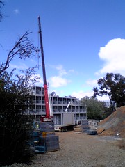
Containerised apartment module ready to be lifted into position at ANUThe Australian National University is building Australia's first shipping container apartment building. This ANU Modular Student Accommodation is being constructed at ANU's Canberra campus. This will be known as the Laurus Wing of Ursula Hall and is due to open in 2010. The modules are from Quicksmart Homes.

The building is being made from 75 ISO standard forty foot shipping container modules (in the jargon this is 150 TFUs). These are being stacked five high to make 70 self contained apartments.

The construction is processing at a rapid pace, with modules arriving by truck and being lifted into place by a crane. On the day I took some photos there was only one container on the top level of the building, but by the following day another four apartments had been added.

3D rendering of a modular apartment at Laurus Wing, Ursula Hall, ANU by Quicksmart HomesThe building has a simple design, with a concrete stairwell at one end and a rectangular stack of containers next to this. The modules come in two basic designs, each using a forty foot container. One design is fitted with a kitchen and bathroom. This is used on its own to make a "Single Studio" apartment. To this can be added a second container with two bedrooms.

Each container has a balcony at each end. These appear to have multiple functions. The balconies provide extra space and shade the apartment from the sun. The balconies also appear to be the method of access to the apartments. In addition, by having the windows and doors recessed inside the balcony, this protects them during transport.

Artist Impression of Laurus Wing, Ursula Hall, ANU by Quicksmart HomesAll the containers are painted a light grey, off-white. The sides are standard ribbed steel (these sides will be hidden in the building). The artists impressions of the building shows coloured panels on the balcony railings, but these panels appear to have yet to be fitted (perhaps to protect them form damage in shipping). If built as per the rendering, the building will look much better than the best known shipping container housing, which is the Dutch Keetwonen project.

The apartments appear to be well appointed. One inclusion which I don't think is needed, is a wall mounted flat screen TV. A better option would be to offer the student a desktop unit which could function as a TV and as their computer monitor.

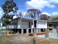
Prefabricated offices being built at ANUThe ANU is also constructing some offices using more conventional prefabrication techniques. Compared to the shipping container apartments, which show flare and daring, the prefabricated buildings look very dull and detract from the image of the campus.

Labels: , , , , , , ,

Sunday, October 04, 2009

Paddington Reservoir Gardens and Architectural Display

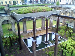
Garden supported by the Brick arches of the Paddington Reservoir GardensThe Paddington Reservoir Gardens turned out to look disconcertingly like the digital architectural rendering. The gardens are worth a visit, if only for comparison with the Basilica Cistern of Istanbul. While more than a thousand years separate the two, it is remarkable how similar the design is (as they are both underground water tanks).

The roof of the 1880's underground water reservoir opposite the Paddington Town Hall was collapsing, so it has been partly removed to make a sunken garden. Part of the roof has been repaired and is available for cultural activities. Some of the vaults of the old brickwork have been retained to support some of the garden. Considerable effort (and money) has been lavished on the work (perhaps a bit to much money). The garden has the look of a digital rendering, with the sharp edges of the new steelwork just a little too precise and a little too designed. The patchwork of the cistern in Istanbul looks more genuine. But perhaps that takes a thousand years.

The Saturday Paddington Markets were disappointing, due to rain. Better was the foyer of the Chauvel Cinema in the old Padding Town Hall. This art house cinema is furnished in the style of a university student share house, with sixties velour couches. The cinema is currently showing Van Diemen's Land.

The architectural exhibitions at City of Sydney Library at Customs House is worth seeing. There are three levels of displays by young architects. The ground floor has "Testing Reality" with multiple representations of Harry Seidler's 1949 Marcus Seidler House. As well as traditional hand made wooden models, there was a Lego bricks odel, 3D digital printed plastic and one in PDF.

"Ulterior Motives" is a display of UTS architecture students proposals for sustainable development of the Ultimo Precinct around the university.

Least interesting of the displays was
"Remodelling Architecture: Architectural Places - Digital Spaces" with some poorly executed digital works, reminding me of the cover of a cheap science fiction novel. One problem with all of the exhibitions was the lack of a web presence. For displays emphasising digital work, it is odd that there was no web address provided for any of the works directing the viewer for more details. This appears to be a failing in the education of architects in general. Even where there are architectural web sites, they tend to be so poorly designed as to be of little use.

A visit to Sydney's Paddy's Markets for some fresh produce ended the day. To get around to all those, I planned the journey using the excellent, Transport Info 131500. The buses ran as per the planner, but were surprisingly crowded for a weekend. The NSW Government clearly has failed to plan Sydney's transport and the system is near collapse, despite the advertisements currently running which claim improvements in timetables.

Labels: , , ,

Thursday, October 01, 2009

2009 Wilkinson Lecture at University of Sydney

Greetings from Law Lecture Theatre 101 at The University of Sydney where Richard Francis-Jones, Design Director of Francis-Jones Morehen Thorp (fjmt) is about to deliver the 2009 Wilkinson Lecture. The topic is "Identity Crisis: Dilution of public domain & the rise of the art museum as urban panacea of our time". This seems to be about museums becoming more commercial, but that should become clear as we go along. There will be a podcast available after the talk and I will provide a link to it.

The Wilkinson Lecture is named in honour of Professor Leslie Wilkinson the architect who was responsible for many of the early campus buildings. Richard Francis-Jones is architect of the new law building at University of Sydney, were the talk is being held.

Mr. Francis-Jones started with a grim monochrome view of the Sydney skyline. He argued that we should not see the commercialisation of the modern city as entirely negative. He then argued that virtual public spaces, such as Iranian Internet protests, were positive. He related this to the boulevards of Paris, which were part design to control protest.

Shopping centres and airports are, argues Mr. Francis-Jones, pseudo public spaces, having the appearance of public but being design for turbo-consumerism. He argues that architects have become enamoured of designing such spaces, which like Dubai, which has no social answer to spiritual needs and becomes a city of consumer junkies in a consumer monoculture.

Mr. Francis-Jones sees the public library and art museum as a bulwarks against the advance of the shopping centre. He used the example of the Blacktown Public Library. He argues that the art museum is the temple of the 21st century city, but while becoming a public brand for the city with a landmark building by a well known architect.

The example used was the "Bilbao Effect" named for the Guggenheim Museum Bilbao by architect Frank Gehry. This one building is credited with boosting the economy of the city and region around it. The Sydney Opera House is a global brand now for Sydney.

Mr. Francis-Jones then attempted to draw a distinction between the artistic integrity of the Sydney Opera House and Bilbao as architecture as sculpture. Is the art building just a "decorated shed"? I think he is on very shaky ground here: the Sydney opera house is not a very functional building and far from just a shed to put art in. Also he seems to forget that a museum building is not a museum, it is a building for some of the artefact's and functions.

The discussion became even more shaky by comparison of buildings with Uluru (Ayers Rock). Uluru is a sacred and supernaturally constructed object to the Pitjantjatjara and Yankunytjatjara people. To compare this with architecture might be too much like seeing architects as gods.

Mr. Francis-Jones then got onto firmer ground by showing his designs for the extensions to the Auckland Art Gallery (Toi o Tamaki). This will have a floating canopy of kauri. The design has received positive, if sometimes grudging, comments.

One questioner asked if the law library in this new building should be so noisy. The architect argued the library should have different spaces with different acoustic qualities. There are "live " spaces designed for silence and other softer spaces for conversation.

I asked if the western idea of an art museum was too pure. In 2005 I spent a week in Samoa teaching web design to museum staff from across the pacific for a UNESCO project. One aspect of this was that many of the museums represented were commercial and craft workshops. They did not just display old objects and high art, there were contemporary items on display. These museums also held cultural events, with dance and music as well as provided facilities for works to be produced and sold. Mr. Francis-Jones pointed out this was a complex issue and that he illustrated his talks with many art works which were in public spaces, not isolated in galleries.

The host ended the evening by pointing out it was brave for an architect to give a talk in his own building. This was a useful reminder that whatever architects might say, it is by the buildings they build they must be judged. The extensions to the Auckland Art Gallery look interesting, but I am not so sure about the new University of Sydney Law building. Perhaps this is what the client wanted, but it is a huge imposing structure, not on a human scale. From the outside it is not clear how to get into the building, or if there are actually any people in there. Inside the corridors outside the lecture theatres reminded me of a modern railway station, with vast expanses of very wide corridors. I feel very small and isolated, wandering along looking for a toilet.

Lecture theatre 101 was well designed and equipped. I found the pull out table on each seat was just the right size for my netbook, but there were no power points (I had to plug my 3G wireless station into the podium at the front of the room, which the average student could not do). However, it is not clear to me what exactly is supposed to happen in these big rooms: surely the University is not expecting to provide education here?

The University of Sydney Law building reminds me of a 19th century factory building where rows of workers used to labour. New methods of production have been developed which have rendered these buildings obsolete. In the same way new methods of university education have arrived which have rendered large lecture theatres full of rows of students obsolete. It is handy to have a large room for the occasional public oration, but in educational terms this is an obsolete facility.

The university would have been better off with a more human scale (and cheaper) multi purpose building with a flexible learning centre. Rooms with flat floors are adaptable to multiple uses and refurbishment. It is going to be very difficult and expensive to refit the University of Sydney Law building to be used for modern education. It would be a shame to have to demolish a new building, but that might be the most economic option.

Labels: , , , , ,

Art museum as urban panacea

Richard Francis-Jones, Design Director of Francis-Jones Morehen Thorp (fjmt) will speak on "Identity Crisis: Dilution of public domain & the rise of the art museum as urban panacea of our time", 1 October 2009, University of Sydney. It is a little had to work out exactly what he will be talked about from the description give, but it seems to be about museums being more commercial.

In 2005 I spent a week in Samoa teaching web design to museum staff from across the pacific for a UNESCO project. One aspect of this was that many of the museums represented were commercial and craft workshops. They did not just display old objects and high art, there were contemporary items on display. These museums also held cultural events, with dance and music as well as provided facilities for works to be produced and sold. In this way they were far in advance of museums and art galleries in Australia, as well as being much more interesting. I ended up learning as much from my students, than they learnt from me.

ps: Francis-Jones Morehen Thorp (fjmt) appear to be having an identity crisis of their own, with a poorly designed web site. This home page depends on the use of Flash, making it of limited value. The web site doesn't appear to have provision for those with Flash to use the web site, nor for those with disabilities. The home page scored only 62/100 on the W3C mobileOK Checker. However, the page appears to consist mostly of a link to Flash content and would be difficult, if not impossible to use without it.

Identity Crisis: Dilution of public domain & the rise of the art museum as urban panacea of our time


1 October 2009

2009 Wilkinson Lectre
Identity Crisis: Dilution of the public domain and the rise of the art museum as urban panacea of our time
RICHARD FRANCIS-JONES, Design Director of francis-jones morehen thorp
Introduced by Professor Alan Peters, Chair of Urban & Regional Planning

Richard Francis-Jones will discuss the nature of the public building as a social representation and fundamental transformations of the public realm within a contemporary condition where identity is blurred with consumption. Within this blurred context he will present recent Francis-Jones Morehen Thorp investigations into the nature of the art museum and public building.

Brief Bio
Richard is the Design Director of francis-jones morehen thorp (fjmt), a practice noted for its commitment to the enhancement of the public domain. He has led the design of many international competition and award-winning projects. Commissions have won the highest Australian Institute of Architects awards: the Sir Zelman Cowen Award for Public Buildings; the Sir John Sulman Medallion; the Lloyd Rees Award for Excellence in Civic Design; the Lachlan Macquarie Award for Heritage; and the Greenway Award for Conservation.

Recent completed projects led by Richard include the University of Sydney Law School, the Surry Hills Library and Community Centre, and the Mint. Projects currently in construction include the Auckland Art Gallery, Chatswood Civic Place and the six GreenStar Darling Walk commercial campus.

Richard is a Visiting Professor at UNSW and has taught architecture at many universities in Australia and abroad. He is an editor of Content, a critical journal of architecture, has written theoretical papers for several journals, was President of the AIA (NSW Chapter) from 2001-2002, and was Creative Director of the 2008 AIA National Architecture Conference: Critical Visions.

He studied architecture at the University of Sydney, receiving the University Medal for Architecture upon graduation. He subsequently completed a masters degree in architectural design and theory at Columbia University in New York. He is a registered architect in all Australian states and New Zealand.


Time: 5.30pm drinks, 6.30-7.30pm lecture

Location: Faculty of Law Lecture Theatre 101, The University of Sydney

Labels: , , , , ,

Wednesday, July 15, 2009

Retrofitting offices apartments for sustainability

The University of Sydney is hosting a workshop on "Retrofitting Using Bioclimatic Principles: Looking for Value Adding", 3 August 2009. This concludes with a keynote lecture by Dr Ken Yeang, author of Ecodesign: A Manual for Ecological Design, Eco Skyscrapers, Dictionary of Eco Design and other works.
It is common to apply sustainable principles to new buildings and this has produced very good results. But what about our existing building stock? Can the same sustainability principles be applied when existing buildings are renovated? These are important questions for all architects and related professionals. This conference will bring together local experts and internationally renowned architect Dr Ken Yeang from Malaysia and the UK to look at the current research and its application to warming climates.

What will the workshop discuss?
* Bioclimatic design principles for renovation of office and multi residential buildings
* Green technologies available for retrofitting
* Retrofitting Comfort
* Trend analysis of environmental performance
* Building performance modelling
* Financial Modelling
* Value adding through sustainable retrofitting
* Case studies - success stories

Some of the Speakers include:

* Dr Ken Yeang, Principal, T.R. Hamzah & Yeang, Malaysia
* Franc Barram, ENSIGHT
* Dr Richard de Dear, University of Sydney
* Lester Partridge, AECOM, Sydney
* Dr Edward Halawa, University of Southern Australia
* Assoc. Professor Mark Luther, School of Architecture & Building, Deakin University
* Professor Deo Prasad, Faculty of Built Environment, University of NSW
* Mr Pat Cody, AECOM, Sydney
* Craig Roussa, INVESTA
* Dr Leena Thomas, University of Technology, Sydney
* Dr Davi Leifer and Mr Alan Obrart, The University of Sydney
* Mr Bruce Precious, Low Energy High Rise, Warren Centre
* Dr Marci Webster-Mannison, The University of Queensland (TBC)
* Postgradute students ...

Who Should attend?
Builders, local Government planning, engineering and management professionals, private sector development specialists and other professionals ...

From: "Retrofitting Using Bioclimatic Principles: Looking for Value Adding", USyd, 14 July 2009

Labels: , ,

Thursday, July 09, 2009

Shared Office Design Cabinets

Shared Office Design for six people, two at a timeHere is a shared office design for six people per office, two at a time. Unlike the previous design, there are no mobile pedestal units. Instead there is one fixed drawer per person at the desks, for small items. All other storage is in cabinets on the opposite wall. This reduces the problem of having to wheel a drawer unit around.

Labels: , , , ,

Sunday, June 28, 2009

Shared Office Design

Shared Office Design for six people, two at a timeOne way to reduce energy use in offices is to have more sharing of printers, but another way is more shared office design, with more people per office. The example I will use is for visiting and adjunct staff at the School of Computer Science, in the Computer Science and Information Technology building (CSIT), ANU, Canberra. A simple arrangement could increase the number of people per office three to six times.

The CISCO Connected Workplace proof-of-concept project proposed reducing space per employee by 40% from 160 to 106 square feet, for general administrative personnel. CISCO estimated a reduction in energy use through this and other techniques of 58% from 423.9 W to 178.7 W per employee.These figures are comparable with those my students estimated in the Green ICT course.

One way to reduce energy consumption of a building is to make better use of the space. One way to do that is to make sure the space is fully utilised. Like other academic institutions, the ANU has Academic Affiliates. These are people who are not full time staff, but have an association with the institution. They provide a valuable connection between the university and industry, government, other research organisations. Some are on campus daily for some days or weeks, others visit for a few hours or a day every few days or weeks.

Normally a professor would get their own dedicated office, and a lecturer a smaller office. Such an arrangement is wasteful, both of space and energy, for affiliates who may only use the office a few days a month.

Some institutions solve the space problem with open plan offices. However, as a high status organisation which places a premium on the thinking time of its people, this would not suit the ANU. One alternative used is to place two staff in one office. This doubles the space efficiency, but more is possible.

A simple option is to time share the offices, with provision for more staff to share the offices at different times. A workable option would be up to six staff per office. According to "The Google Way: How One Company is Revolutionizing Management As We Know It" (Bernard Girard, No Starch Press, 2009) six is the optimal number for a team. So this is a reasonable number of people who can work out an arrangement together (it is not coincidence that the six cup coffee pot is the most common and the original AppleTalk protocol applied six computers in work group). Also it would be difficult to fit storage for more than six people in a typical office. With six in one office, they each get about one day a week, or about two days a week if the office is shared by two people.

There are many shared office designs featuring hot-desking. These may involve the staff member collecting a wheeled unit with their items from a locker room near the foyer of the office building and taking it to an allocated cubicle. This arrangement would not suit the ANU environment. Apart from the implied reduction in status for the people, it would need a large scale to be feasible, extensive changes to building fit out and would also eliminate the informal interactions between personnel which are valuable in a research environment.

The CSIT building is currently partitioned for two sizes of offices, the smaller for lecturers and ones twice as large for professors. For visitors and adjuncts, two may be allocate one office. Offices have one long wall fitted with floor to ceiling adjustable shelves, intended for a large number of books academics typically have.

Visitors and adjuncts tend to have fewer books, allowing for a reallocation of space. If the bottom two shelves are removed, this provides a desk height floor space. An under desk mobile pedestal unit could be placed in this space. These units are about 500 mm wide, so six units would take up about 2m, allowing for some space between. With one drawer unit allocated to each person, the shelf space above each drawer unit could also be allocated to that person.

Ideally there would need to be some secure storage for paperwork and other items. This could be done with lockable cabinets and vertical filing units replacing some of the shelves. This would provide about .4 m3 of storage per person, or about the size of five filing cabinet drawers, or one common size vertical locker.

With only six people to a room, there would not be a need for a complex booking system. But some form of online noticeboard would still be needed to say who was going to be in when. Also some way to allocate telephone numbers would be of use. Each person could be allocated their own telephone number, which would be forwarded when they were not at the office.

Labels: , , , ,

Sharing Printers to Reduce Energy

The students in my Green ICT course just completed their first assignment on estimating the greenhouse gas emissions from ICT in the organisations where they work. What stuck me was how much energy the average office uses. As an example, I found an estimate that a office worker causes about 1,078 kg-CO2/person/year in Japan and 2,470 kg-CO2/person/year in the USA.The students came up with comparable figures for Australia. One way to reduce this is to have more sharing of resources. This can be sharing of equipment (such as fewer printers).

The conventional wisdom now is to have offices equipped with fewer small printers and more larger "multifunction" devices. The MFDs look like photocopiers, but function as a copier, printer and fax machine. The problem with this is that the devices purchased tend to be over sized, thus resulting in more energy and paper use. Also the MFDs have a higher standby energy consumption, due to their multi-function and multi user nature.

The staff at the Department of the Environment and Heritage used 30 sheets of paper per person per day in 2004. That seems a lot of paper, hopefully it is someone more like 3 sheets a day by now, but assuming it is correct, how many printers are needed? The Fuji Xerox DocuCentre 1055 is one of the low volume laser MFDs (such unites cost less than US$500). It prints at 15 ipm (Images Per Minute). Assuming the staff at Environment are printing their pages double sided, that is 2 images per page, or 60 images per person per day. Assuming a 5 hour day, the 1055 can print 2250 pages a day, enough for 75 staff.

The building 1 Molonglo Drive in the Brindabella Business Park in Canberra is offering floors of 2,586m2. The NSW Government aims for a fit out of 15m2 per person, resulting in 172 on a floor in Molonglo Drive. At 75 staff per printer, this would result in only 2 printers per floor.

Clearly some departments have the larger MFDs. The ApeosPort-III, as there are documents scanned in with such a unit on the web. At 25 ipm, this unit could service 125 staff. Having two of these devices per floor would be excessive, but having only one printer would be operationally difficult.

The five floors of 1 Molonglo Drive have space for about 856 staff. The building might have two larger printers, such as the HP Laserjet 9040N at one point in the building and four smaller devices on each floor. The devices on each floor need not be "multi-function". It may be much cheaper and more energy efficient to have separate scanners and printers.

One option would be to procure low cost MFDs (less than AU$100) with ink jet printers, but not equip these with any ink, so they are just used as scanners and fax sending devices. The printing would be done on separate dedicated devices. Inkjet printers use far less energy in standby than laser print devices.

Techniques to discourage staff from printing could be used, which would also reduce the capital cost of the equipment. As an example most of the devices could be not fitted with automatic staplers or collating devices. This would discourage the staff from printing multiple copies of multi-page documents. It would also greatly reduce the cost of the printers and maintenance.

All documents printed, scanned or faxed could be automatically retained in the organisation's electronic document management system. All documents printed could include a machine readable code, which would be automatically read and matched in the electronic document system. An electronic notice would be sent to the staff member responsible for printing or scanning a document, requiring them to link it to the appropriate electronic file. This would make the point to staff that they should send electronic, not paper documents, where possible and also remind them that the printers are for business not personal use.

Labels: , ,

Sunday, June 21, 2009

New Architecture from Berlin in Canberra

The Gallery of Australian Design opened in Canberra last month in Canberra, with two exhibitions: Stadt und Haus - New Architecture from Berlin and Far Away so Close . These were disappointing, consisting almost entirely of not very inspiring photographs. In a case of life imitating art, this gallery appears to be designed to find some excuse for an otherwise useless building in the Parliamentary triangle, as satirised in the TV comedy The Hollowmen.

The gallery is at Commonwealth Place, Parkes and open Wednesday to Saturday 10.00am-4.00pm. Unfortunately the gallery appears to have no web site associated with it. Perhaps the next exhibition will be better, whatever that might be (as there is no web site there is no way of knowing). But I suspect we will see this "galley" close within six months.

Labels: , ,

Sunday, June 14, 2009

Gallery of Australian Design

The Gallery of Australian Design opened in Canberra 22 May 2009 in Canberra, with two exhibitions sponsored by the Goethe Institute: Stadt und Haus - New Architecture from Berlin and Far Away so Close (photographs) until June 20. The gallery is at Commonwealth Place, Parkes and open Wednesday to Saturday 10.00am-4.00pm.

In a case of life imitating art, the gallery is in one of the buildings featured in the Australian TV comedy The Hollowmen. In series 2, episode 2 of the series, "Edifice Complex", a fictional Prime Minister wants an arts building named after him. As Canberra is already over catered with art galleries, a permanent building for temporary art exhibitions is decided on. The German term for such a building is used and much fun is had over the pretensions of German architects. The building the real Gallery of Australian Design is in is featured in the program.

Labels: , ,

Role of ICT in environmental ratings for buildings

The continuing education article "LEED Looks Ahead With an Ambitious Overhaul" by Joan Gonchar (May 2009, Architectural Record), provides a good overview of the widely adopted LEED program for energy and environmental rating of buildings. The third version of the program is now coming into use, expanding consideration of the environment the building is in. One aspect which could be developed further is the use of ICT in buildings. While ICT systems used in operating the building, such as for control of lights and air conditiong are likely to count to LEED, thous used by the building's occupants are not. ICT makes up a significant part of building energy use, as an example I have estimated for the Australian National University, Computer Science and Information Technology building my office is in that desktop computers consume about one third of the energy in the building. This is without counting the servers, supercomputers or the air conditioning load from them in summer. Building consideration of ICT in the buildings into LEED might allow for better planning.
Since its launch in 1998, the Leadership in Energy and Environmental Design (LEED) program has become widely accepted as the standard measure of sustainability for buildings. To date, almost 21,000 projects, representing more than 5 billion square feet, have registered their intent to seek certification under the system. Another sign of the program’s success is the long list of municipalities, state governments, and federal agencies that have adopted LEED, incorporating it into construction guidelines, legislation, and requirements for incentive programs. ...

From: "LEED Looks Ahead With an Ambitious Overhaul" by Joan Gonchar, May 2009, Architectural Record

Labels: , , , ,

Friday, June 05, 2009

Making Sydney Sustainable

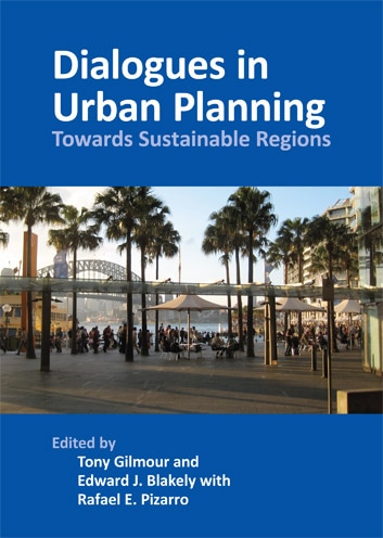
Dialogues in urban planning book launchThe next presentation in the University of Sydney "Current Thinking Series" is "Making Sydney's Future Sustainable", 17 June 2009. I attended the April event with Kristina Keneally, NSW Minister for Planning and this was well worthwhile. The June event is the launch of the book "Dialogues in urban planning: towards sustainable regions" by Tony Gilmour.

This book is timely as the federal government has promised $91 million for planning the Sydney West Metro. The funding is for pre-construction, planning, design and engineering works, so the project can be put to public tender in 2010. However, the NSW government has a poor track record in such metro projects and some wider thinking about transport and sustainable development for Sydney would be worthwhile.

Unfortunately Sydney University Press have not managed to get the book into the Amazon.com catalogue yet


Making Sydney's Future Sustainable

In an age when the buzzword is 'sustainability', why do we continue to build unsustainable cities and regions? Are there alternatives to car-clogged streets, suburban McMansions and degraded natural environments?

This presentation celebrates the launch of 'Dialogues in urban planning: towards sustainable regions' by Sydney University Press, a book showcasing research by staff and doctoral research candidates at the University of Sydney. The event will feature a panel of well-known Sydney scholars. The 'Q&A' format should encourage a lively debate.

If you have questions you would like the panel to consider, please forward them to Sue Lalor when you RSVP. The panel will include:

Professor Richard Hyde, international sustainable architectural design specialist

Professor Peter Phibbs, pioneer of urban sustainability and climate change initiatives in western Sydney

Professor Ed Blakely, recent 'reconstruction tsar' for New Orleans and prime mover behind Sydney's metropolitan strategy

Associate Professor Nicole Gurran, land use planner and expert on the growth of sea-change communities

Tony Gilmour, affordable housing expert and lead editor of Dialogues in Urban Planning

For more information on this event, please download the event flyer.

The event is free of charge and will be held at the University of Sydney in the Wilkinson Building, 148 City Road. If you would like to come please RSVP to Sue Lalor on (02) 9351 2686 or via email at slalor@arch.usyd.edu.au.

*This event attracts PIA Professional Development points. ...

Labels: , ,

Friday, May 22, 2009

Low Power Lights and Solar Systems for Education

Greetings from the DesignBUILD 2009 exhibition which features "Green Building" section at the Sydney Convention & Exhibition Centre in Sydney until 23 May 2009. One product which got my attention was a low cost solar power system from Soanar for $899 (show special). This has a 80 Watt solar panel, controller, 600 Watt 230 Volt inverter and 100 AH sealed lead acid battery. This is enough for a small independent power source for a holiday home or perhaps a one room school.

One issue which such small solar systems bring into focus is the amount of power used. Soanar were also selling low power LED replacements for halogen downlights and LED strips to replace fluorescent strips. However, if you replace halogen and fluorescent lights with LEDs of equal brightness the cost will be high. In many cases there is more light provided than really needed. Frank Harrington from Soanar said they will custom design lighting layouts for industrial and business use. I suggested a 1 Watt down light would be useful where too many down light have been installed (and a dimmer is used). The 1 Watt LEDs are much cheaper and do not require a large heat sink.

Another application where less light is needed is in libraries converting space to learning commons, such as the one University of Canberra Library are building. Libraries need brightly lit areas for reading and particularly university libraries where blurry archival documents may be used. However, a learning commons will mostly use computers. In this environment the general lighting can be much lower and task lighting used. This can save 75% of the energy used in lighting (and as much again in air conditioning power used to take away heat from the lights).

Labels: , , , , ,

Sunday, May 17, 2009

Web support for Victorian bushfire rebuilding

In response to concern expressed in the media about delays with permission to rebuild after bushfires, some Victorian councils have put in dedicated staff to assist with bushfire related building planning issues. However, what might be more useful is if the state government introduced uniform procedures and a web based approval system to be used by all councils. The one team of helpers could then be used across the state, accessing the system via wireless laptops and smart phones in the field while with the residents. It should then be possible for most permissions to be granted via the system on site in a few minutes. The performance of the councils can also then be monitored, with the time between and application being lodged and approved being reported to the minute, for all councils across the state automatically with daily reports on the Victorian Government web site.

Labels: , , , , ,