Wednesday, February 03, 2010

Green Learning Commons

Prompted by "What Happened to the Computer Lab?" I was asked by Idris Sulaiman if there are any Australian guidelines on Green Computer Labs. This is a good question. Computer labs are evolving into general purpose computer equipped teaching spaces in the information commons and spreading across university campuses, as well as vocational education and schools. As a result there will be more computers using more energy (and causing more e-waste) at educational institutions. Green guidelines for these are therefore becoming more important.

The guidelines for university teaching spaces in Australia are mostly about how many square metres of space to allocate per student. The allocations for computer equipped labs are much higher than for traditional classrooms. This will cause a further environmental problem for education, as computer equipped spaces become the primary form of teaching space on campus. This could result in a doubling of the environmental footprint of the institution, as well as greatly increased costs.

As I teach my green ICT students, the the best and primary way to reduce the environmental impact of computers is with efficient, cost effective design. Building a computer equipped classroom which requires half as much space per student will reduce the materials required and energy use. If it is cheapr to build as well, that will make it more likley it is built.

There are some good examples of computer equipped learning centres in Australian universities, some of
which I have visited and commented on in my blog under the headings classroom design and flexible learning centre.

Perhaps we should look at writing some guidelines and build two prototype green computer labs.

Some time ago I did a short exercie to see how one of the ANU Computer Science computer labs could be adapted for belnded learning. With this I propsoed to double the number of students the room could hold and allow for individual, group and whole class learning styles.

Also I proposed a portable centre, which would be a airline carry on wheeled bag with enough equipment for a dozen studnets.

Perhaps we could build some prototypes using ALTC funding and provide some guidelines. The results can then be incorporated into free open access e-learning materials, in a similar format to my Green Technology course, but perhaps with some more video and audio.

Others might like to join in this work.

Labels: , ,

Sunday, December 13, 2009

Redesigning universities for computer assisted learning

An interesting discussion is taking place online about how to redesign university teaching spaces to accommodate computers. This includes the issue of how computers should be added to science labs, or should they be separate. Should desktop computers, or laptops be provided, or can we assume students will have their own laptops? Should these spaces look like traditional teaching spaces, like business offices or like cafes? In my view, as computer equipment becomes cheaper, smaller and more portable, this may go full circle, with computers seeming to disappear from universities and other learning institutions, as they become built into the fabric of the institution. With wireless throughout the campus, there will be less need for sockets on walls and wires. As students carry around their own wireless linked smart phones and laptops, there will be fewer desktop computers apparent. Large screens will be built into walls or concealed in ceilings, projecting onto walls.

Some of this discussion is talking place on EDUCAUSE in the Instructional Technologies Constituent Group. A readable item is "Rebooted Computer Labs Offer Savings for Campuses and Ambiance for Students" (By Ben Terris, The Chronicle of Higher Education, December 6, 2009). Some more scholarly items are listed in "Learning Spaces" (by Jeff Johnston, Vanderbilt Center for Teaching).

Labels: ,

Tuesday, December 01, 2009

Origami classroom furniture

Modular Computer Desks from Academic Computer FurnitureAcademic Computer Furniture Pty Ltd sell a range of modular computer classroom furniture which reminds me of origami. The desks have geometric shapes which look like they have been folded from a sheet paper. But on closer inspection it appears they have been cleverly cut from a single rectangular sheet, to minimise waste material. Behind the physical design is an interesting philosophy of group interaction pedagogy.

Labels: , ,

Wednesday, November 11, 2009

How to Create On-line University Courses in Electronic Archiving: Part 16 - Redesign for 2010

After the success of my Green ICT Strategies course (which will be run again in 2010) , the Australian National University has asked me to design and run "Electronic Data Management" (COMP7420) as well in 2010. This is an expanded and accredited version a short intensive course I ran in 2007 at the request of National Archives of Australia. The notes for that course are online. I started preparing for the course in mid 2008 but it was not clear if there was a demand for such a course so it was put on hold for two years. In the interim much has happened with e-document management and I know more about e-learning.

COMP7420: Electronic Data Management

Summer session (1 February 2010 to 31 March 2010)

Topic:

Record keeping and data management are essential to support the efficient and accountable performance of business and government yet up until now there has been no training available for a systems approach to this important area.

To fill this gap, the ANU has developed several short courses that provide people in government agencies with the critical skills needed to manage government information and records in a manner that keeps pace with international trends and changing technology.

This course aims to teach students how they can manage electronic data. Students will learn about electronic data management through online learning, which includes tutoring, mentoring, student discussion forums and weekly feedback.

For more information on the course design and content e-mail Tom Worthington.


Delivery: On-line with no attendance required.

Students undertake the course entirely online via the web from anywhere in the world. Available:

For information on enrolling in this course including fees, please see enrolment information. If you have any queries concerning enrolment e-mail Debbie Pioch (phone 6125 8020).

The StudyAt entry for Course Description and Learning Outcomes and the Course Flyer provide more information.

COMP7420 is a three unit course and is offered subject to sufficient enrolments.


Assessment:

The course is designed to assist the student to see how the course material applies to their world, to compare and select different data mining techniques appropriate to a problem and to understand the implications of those decisions.

Assessment is through:

  • 10% Online quizzes
  • 20% Online Discussion/ In-class participation/ Learning Journal
  • 40% Exam
  • 30% Case studies project

Designer: Tom Worthington FACS HLM, consultant to government and industry.

The course is designed by Tom Worthington, a past President, Fellow and Honorary Life Member of the Australian Computer Society. Tom headed an Australian Government committee which developed electronic document management policy for government agencies.

Labels: , , ,

Friday, October 09, 2009

My last examination

Today I told my fellow educators for the course COMP3410 at the Australian National University that this was my last examination. What I did not expand on was that this was not just for this course, I will not set any examination questions for any course. My hope is to able to continue to contribute to courses at ANU and elsewhere, and to design assessment for them, but do not ask me to write examination questions.

Last year I decided to give My Last Lecture and put into practice what I have been learning about combining online teaching and live group work. This was not an easy decision and has taken considerable work, both in reformulating course material and explaining the change to my colleagues.

My first ANU course with no lectures and no examinations finishes in a few weeks time and so far has gone reasonably well. Reformulating the material did take some work. What surprised me was the amount of explanation I had to do to colleagues. Many had difficulty with the idea of a course with no lectures. Even after I had announced that I would not be giving any more lectures there were many who asked me to give lectures. It took some time to reassure them that there were workable alternatives to lectures and this was permitted under university rules.

What I found surprising was that the formal university processes had no problems with a course with no lectures or examinations. Provided what was being taught and how it was being assessed was clearly spelt out, there was no impediment to a course without lectures or examinations.

The group who did not need any convincing were the students, who were very happy with the idea of no lectures. Some students seemed to think no lectures meant no work and an easy course, but soon changed their view when they saw there was compulsory assessed tutorial work each week. Some dropped out early, but not as many as for a conventional course.

I don't like setting examinations to be conducted on paper, over several hours, without the student being able to use external resources. This is not an effective form of assessment, nor is it useful for learning.

An examination is very different to the ways the students could expect to use what they are learning the real world. What is more realistic is have them briefly reply to a few short questions, discuss issues in a group and to write reports over days or weeks, with a library and the Internet at their disposal. That is the form of assessment I have used in the Green ICT course, with assessment for weekly discussion and written assignments.

There is a role for tests in courses and this can be by interactive assessment. These can be used to asses the student's level of knowledge to help with the learning as well as to give them a final grade. But the assessment should be a realistic facsimile of what happens in the real world. Assessment can use simulations and other techniques for being more realistic. Tests can be online and in part multiple choice. There can be many short tests, rather than a few large ones. I hope to explore this next year.

Labels: , , , , ,

Wednesday, September 23, 2009

Experiments in Virtual and Distance Education

Dr Euan Lindsay will give a free seminar on "Virtual and Distance Experiments: Pedagogical Alternatives, not Logistical Alternatives" at the Ian Ross Seminar Room, The Australian National University, 2 October 2009 1pm:
Laboratory classes are an integral part of undergraduate engineering education, providing a valuable alternative to lectures and tutorials. Recently there has been a trend towards providing these laboratory classes through remote or simulated access - where the students are separated from the hardware and interact through a technology-mediated interface. This trend is driven by a demand to provide increased flexibility and opportunities in the delivery of laboratory classes to students, but it also has the consequence of affecting the learning outcomes of the laboratory class.

Dr Lindsay's work in Remote and Virtual laboratory classes has shown that there are significant differences not only in students' learning outcomes but also in their perceptions of these outcomes, when they are exposed to the different access modes. These differences have powerful implications for the design of remote and virtual laboratory classes in the future, and also provide an opportunity to match alternative access modes to the intended learning outcomes that they enhance.

This presentation will address not only the nature of these changes and the factors that cause them, but also the place that remote and virtual laboratory classes have within an undergraduate engineering curriculum. ...

Labels: , , , ,

Sunday, August 23, 2009

Personal pod settings for blended learning

Andrew Leach reviews Richard Kurk's design for the University of Queensland's new GPN4 (General Purpose North Four) building in Architecture Australia magazine (July August 2009). The building includes a Collaborative Learning Centre (CLC) and an Advanced Concept Teaching Space (ACTS). The design won a regional commendation in the 2009 FDG Stanley Award.

Collaborative Learning Centre in University of Queensland GPN4The CDC has what are termed Personal pod settings. From the provided photo these appear to be boardroom size desks each seating eight students, with four in rows on each side of the table. At one end of the table is a large flat screen display (the display may be on an electrically operated mount to have it retract into the desk). Presumably a human convenor can sit at the other end of the table. One photo shows six such tables, seating 24 students in total. Each seat appears to be equipped with a laptop. The desks appear to be too deep, with an open slot in the middle. In contrast the space beside each seat is limited. The designer could have used narrower longer desks to give more useful space and allow for better group work. Also the room layout looks a little too rigidly defined and I preferred QUT's more flexible arrangement with mobile flat screens.

Advanced Concept Teaching Space in University of Queensland GPN4The ACTS appears to be a 21st century interpretation of the traditional stepped lecture theatre. The rooms appears to seat about 100 students in four tiers. There is what appears to be a LCD display at each seat (perhaps a touch screen?). There appear to be two large flat panel screens and two presentation stations at either end of the stage at the front of the room. The large white wall between the two electronic screens can presumably be projected onto.

Each tier of seating has one continuous curved desk. The desk appears much deeper than would be normal in a lecture theatre (and much larger than needed). But this may be an artefact of the wide angle lens needed to show the expanse of room.

There are swivel high mesh backed executive style chars used in both the CDC and ACTS. These do not appear the most durable choice for a learning environment. Also the large backs will tend to obscure sight lines.


The use of the hardwired LCD screens is questionable (at least they are not built into the desks like some previous designs). Using the same laptops as in the CDC would have advantages, as would assuming that most students would bring their own laptop, netbook or smartphone.

Labels: , ,

Monday, June 01, 2009

Learning Spaces in Brisbane

Gordon Howell with QUT designed portable wireless nodeAfter visiting Brisbane city library at Brisbane Square I took the Free Loop downtown bus service. to Queensland University of Technology, located beside the Brisbane City Botanic Gardens. Gordon Howell, Manager Learning Environments Support at QUT showed me some of their innovations.

One clever item are large flat screen displays (Plasma or LCD) on a mobile carts. Attached to the back of the carts is one of the university's standard PCs. Above the screen is a video conference camera and microphone. There is a tray with a wireless keyboard and mouse beneath the screen. There is a wireless broadband antenna on top of the unit. QUT mobile flat screen with PC and web cameraThis makes a mobile presentation and video conferencing system. Some units can be checked out by staff for use in teaching rooms, saving having to equip each of the smaller rooms with equipment. Other units are permanently tethered in the library for use by student groups.Another development was a "network in a box" this is a weatherproof case containing a 3G wireless device and WiFi. The idea is that one such unit can be set up to provide broadband access to wireless devices in the vicinity. Gordon is also looking at equipment similar to my Portable learning centre and even the deployable classroom.

QUT have taken the approach with their learning commons of providing flexibility for students to arrange the furniture and equipment as described in "Learning Spaces in Higher Education: Positive Outcomes by Design". The Lab 2.0 looked a little chaotic to me, but perhaps that was just a sign of enthusiastic and heavy use by students. Gordon described how at the beginning of the year, the students separated the furniture for solitary work, but as groups formed for projects, they pushed the furniture together so they could work together. The screens on wheels were generally pushed up to one end of a bench, with students down two sides. In some cases mobile white boards have been used as partitions to form team rooms.

Other areas of the learning commons had rows of PCs. The university is looking at the use of thin clients to replace some desktop PCs. One suggestion I made was not to segregate the laptop users from the desktop PC users, perhaps leaving a space free between every few desktop computers for a laptop user.

Then I crossed the Brisbane River via the Goodwill Bridge to visit Southbank Institute of Technology Library. Heather Burrell, Library Manager showed me around their learning commons. The library provides computer literacy training, using computer based courses, for students across the Institute. Students can do self paced courses in the library, with a tutor on duty to assist. They can then do computer based tests with staff supervising. This seems a logical and cost effective way to deliver what is the 21st century version of literacy: being able to communicate using a computer.

It is good to see the library retains an extensive collection of paper books, as well as being equipped with computers and space for laptops. There is less emphasis on flexible movable furniture than QUT and I noticed a much quieter more atmosphere at SIT. One innovation were "diner" style booths around the wall, which seated four students, two on each side of a bench, with a chest high wall separating them from the next booth.

There were several training rooms, each holding about 18 students, with movable walls which could be opened out to the common area and removable partitions between the rooms. This arrangement allows the room to be opened out when not needed for a class.

There were fewer laptops evident at SIT, than QUT's library and less equipment.

Labels: , , ,

Saturday, May 30, 2009

Learning Spaces in Higher Education

I wrote Thursday, May 28, 2009: "I am planning visit to Brisbane, May 30 to June 2 to look at flexible learning and green ICT. Who should I talk to?". One of those who responded was Gordon Howell, Manager Learning Environments Support at QUT. He pointed out the proceedings of a 2008 colloquium: "Learning Spaces in Higher Education: Positive Outcomes by Design". I hope to get along to see QUT's work on Lab 2.0 and see if it lives up to the claims made. I am sceptical of the value for learning spaces with movable furniture:
Lab 2.0 is an experimental learning space designed for students to be able to alter their physical environment to suit their learning needs. Students are encouraged to "make the space work for them"
with new non-traditional forms of movable furniture and related technology. The space is enhanced with technology and collaboration software that enables students to share project work, documents and artefacts in real-time with other group members.

The Lab 2.0 space has been developed in a vacant space within the Library building on the Gardens Point campus. It sits adjacent to more formal computer labs and is seen as a complementary addition to the more structured University computing facilities. The space covers approximately 350 square metres and was redeveloped with a focus on flexibility, simplicity and reuse resulting in a total development cost of slightly less than $90,000 including all furniture, technology, power and data fittings. Based on traditional figures for space redevelopment within the University, the space was redeveloped for between a third and a fifth of the normal costs associated with space redevelopment. ...

From: Lab 2.0, by Geoff Mitchell, Greg Winslett, Gordon Howell, Learning Spaces in Higher Education: Positive Outcomes by Design, NGLS 2008 Colloquium, University of Queensland, 2009

Labels: , , ,

Thursday, May 28, 2009

Green ICT education in Brisbane

I am planning visit to Brisbane, May 30 to June 2 to look at flexible learning and green ICT. Who should I talk to?

Labels: ,

E-learning job at ANU

The ANU College of Engineering and Computer Science is looking for someone to help with e-learning:
Educational Development Officer (G187-09GU)

Administration, ANU College of Engineering and Computer Science

The ANU College of Engineering and Computer Science seeks a suitably qualified person to work closely with academics to increase the flexibility of our teaching program.

LocationCanberra/ACT
Term of ContractFixed Term of 3 Years
GradeANU Officer Grade 6/7 (Administration)
Salary Package$59,698 - $69,143 pa plus 17% superannuation
Closing Date15 June 2009
Position OverviewThe ANU College of Engineering and Computer Science has established a Flexible Learning Unit to carry forward the University strategy to create more flexibility in the way in which students can access courses and programs offered by the College. We aspire to increase the range of students able to access the excellent research and teaching strengths of the College, to improve our ability to make a real contribution to the continuous improvement of engineering and computer science nationally and internationally.

You will work as part of the Flexible Learning Unit, with a focus on moving courses towards blended learning, which combines face-to-face interaction with online learning activities. This work will be undertaken in cooperation with colleagues at the University of South Australia, as part of the "Engineering Hubs and Spokes" project awarded to ANU and UniSA.

Blended delivery of online and face-to-face teaching techniques, University of South Australia.

The successful applicant will:
- Work as part of a team to design, develop and evaluate courses in a blended delivery mode;
- Understand and value the strengths of a research-led university;
- Collaborate with academic colleagues to explore practical ways to engage in educational design and development of courses.

The position would suit someone with experience in educational environments who is comfortable with the subject matter of engineering and computer science, and is interested in taking their experience in education in a new direction.

We expect to make a full-time appointment, but will also consider fractional appointments.

Enquires: Dr Kim Blackmore, T: 02 6125 0411, E: Kim.Blackmore@anu.edu.au
Additional InformationKMBT25020090521112826.pdf
Position description
Responsible toCoordinator, Flexible Learning Unit
Role statementPURPOSE STATEMENT:

The ANU College of Engineering and Computer Science has established the Flexible Learning Unit to carry forward its strategy to create more flexibility in the way in which students can access courses and programs offered by the College.
The successful candidate will work as part of the Flexible Learning Unit, with a focus on moving courses towards blended learning, which combines face-to-face interaction with online learning activities. This work will be undertaken in cooperation with colleagues at the University of South Australia, as part of the "Engineering Hubs and Spokes" project awarded to ANU and UniSA.

KEY ACCOUNTABILITY AREAS:
Position Dimension & Relationships:

With broad direction from the Coordinator of the Flexible Learning Unit, the successful applicant will work with the "Engineering Hubs and Spokes" project team and the CECS Associate Dean (Education) to develop new standards and procedures for implementing blended learning courses. The successful applicant will collaborate with academic colleagues in CECS and UniSA to design, develop and evaluate courses in a blended delivery mode. The successful candidate will engage in discussions on flexible learning locally, campus wide and elsewhere.

Role Statement:

1. Assist the Flexible Learning Unit (FLU) coordinator to plan and document new policies and procedures for blended learning.
2. Provide advice and support to academic staff on educational design, structuring course materials for pedagogically effective off-campus delivery, and the appropriate use of educational technology.
3. Assist areas and teaching programs on a needs basis to develop a proof-of-concept approach to flexible learning in their disciplinary context.
4. Undertake specific tasks in educational design for programs and courses, in consultation with academic and general staff as required.
5. Undertake projects investigating, implementing and documenting technological tools used in flexible learning.
6. Advise on and undertake web design and other online educational technologies necessary for the effective delivery of material.
7. Contribute to research into flexible teaching and learning within Engineering and Computer Science.
8. Other general duties appropriate to the classification level as required.
Selection criteria

A. Qualifications

1. Degree in a relevant field or an equivalent combination of extensive relevant experience and education/training.

B. Experience

1. Interest in higher educational scholarship and practice, particularly with regards to flexible and on-line learning.
2. Interest and/or experience in one or more of the following: Teaching; Facilitation of learning; Design and development of curricula in higher education; Online or flexibly delivered courses; Evaluation.
3. Demonstrated ability to work in a web-based learning environment as well as experience with other desktop applications.

C. Attributes

1. Excellent interpersonal skills and a demonstrated ability to communicate effectively and efficiently (orally and in writing) with staff, students and external institutions while maintaining confidentiality, tact and discretion.
2. Proven ability to work effectively as part of a team and independently as required.
3. Demonstrated ability to use initiative and think strategically, while maintaining effective organisational, analytical, interpretive and problem solving skills
4. A demonstrated understanding of equal opportunity principles and policies and a commitment to their application in a university context.


ANU Officer Levels 6 and 7 are broadbanded in this stream. It is expected that at the higher levels within the broadband occupants, through experience, will have developed skills and expertise enabling them to more independently perform the full range of duties at a higher level, and that more time will be spent on the more complex functions of the position.

Labels: , ,

Wednesday, May 27, 2009

Saving money and energy in the learning commons

The University of Canberra is remodelling one floor of its library into a Learning Commons. Library users were asked for input so I should put in some comments, about the use of furniture, computers and lighting. Here are some more comments about floor space, air conditioning and lights:
  1. Reduce floor area: A major determinate of cost and environmental impact of a building is size: the bigger the building, the higher the financial and ecological cost. I suggest using a higher density of seating than is usual in learning commons: twice that currently used in the University of Canberra library. This can be done by using compact computers, carefully positioning seating and interspersing desktop and laptop positions. A space allocation of 2 m2 per student could be achieved with careful design. This could halve the cost of facility.
  2. Separate Air Conditioning: As the learning commons will be open when the rest of the library is closed, a separate air conditioning system should be used, which just conditions that floor. This will save having to heat or cool the whole building, as is done at present. If there are several enclosed rooms, these can be air conditioned separately, so unused rooms are not conditioned.
  3. Automated lights: Normally libraries leave all lights on when any of the building is open, even when large areas are unused. Lights should shift to a lower power setting when an area is unoccupied and switch back to full power when someone enters. This can be done much more simply with LED lights than with fluorescent lights. It should be noted that lights should not switch off completely in open plan areas for safety reasons. Lights can switch off in closed rooms when they are unoccupied and on again when the door is opened.

Labels: , , , , , , ,

Friday, May 22, 2009

Low Power Lights and Solar Systems for Education

Greetings from the DesignBUILD 2009 exhibition which features "Green Building" section at the Sydney Convention & Exhibition Centre in Sydney until 23 May 2009. One product which got my attention was a low cost solar power system from Soanar for $899 (show special). This has a 80 Watt solar panel, controller, 600 Watt 230 Volt inverter and 100 AH sealed lead acid battery. This is enough for a small independent power source for a holiday home or perhaps a one room school.

One issue which such small solar systems bring into focus is the amount of power used. Soanar were also selling low power LED replacements for halogen downlights and LED strips to replace fluorescent strips. However, if you replace halogen and fluorescent lights with LEDs of equal brightness the cost will be high. In many cases there is more light provided than really needed. Frank Harrington from Soanar said they will custom design lighting layouts for industrial and business use. I suggested a 1 Watt down light would be useful where too many down light have been installed (and a dimmer is used). The 1 Watt LEDs are much cheaper and do not require a large heat sink.

Another application where less light is needed is in libraries converting space to learning commons, such as the one University of Canberra Library are building. Libraries need brightly lit areas for reading and particularly university libraries where blurry archival documents may be used. However, a learning commons will mostly use computers. In this environment the general lighting can be much lower and task lighting used. This can save 75% of the energy used in lighting (and as much again in air conditioning power used to take away heat from the lights).

Labels: , , , , ,

Wednesday, May 20, 2009

Designing a Learning Commons

The University of Canberra is remodelling one floor of its library into a Learning Commons. This is to provide more access to computers and facilities for group work. The library users have been asked for input and plans will be on display in June. As a user who has made a study of such learning commons, I thought I should put in some comments:

Some thoughts on a design
  1. Movable furniture is not necessarily flexible: Many of the designs I have looked at use movable items of furniture, on the assumption this makes the space "flexible". In practice the furniture rarely gets moved, after the initial novelty of being able to move it wares off (apart from when the students get playful and use it for furniture sculpture). Where computers and data access is used having movable furniture become very expensive and creates a large maintenance bill. I suggest instead having fixed, low cost furniture with built in wiring, which and be used in different ways, but without having to be moved. Expensive proprietary cabling systems and modular furniture are not needed: cheap laminate will do. The University of Queensland Ezones have a good arrangement with custom made curved desks with wire baskets under the desks to hold the cabling.
  2. Mix laptop and desktops: One trend has been to provide separate areas for laptops and desktop computers, with the laptops tending to get less space. Instead I suggest mixing the two. An example would be to furnish every second workspace with a desktop computer. This would allow for people with laptops, or for people who don't need a computer. It would also allow space for a group of students to cluster around one screen when working together.
  3. Keep some books and magazines: It is a little depressing to go into a library and not be able to find any books or printed periodicals. I suggest retaining some of these.
  4. Movable walls: While moving furniture is difficult, having movable walls is comparatively easy. The University of Queensland Ezones have a good arrangement with training rooms having sliding glass wall, so they can be opened up to the common area when not in use for a class. The space and computers in these rooms then become available for general use.
  5. Thin Clients: More space and less clutter is possible if very small computer processor boxes are used. There are computers available fitted into the screens, but this limits the range of models available. Most computers provided do not require DVD/CD drives.
  6. Combined digital signage and instruction screens: Large LCD screens are now reasonably priced. The library envisages using these for digital signage to stream news to the students. Some of these screens could do double duty being available for group work and then switching to digital signage when not otherwise needed.
  7. Green ICT: The library needs to look at the energy costs of what is proposed. The Library already uses low power thin client computers for catalog enquires and should look at upgraded devices in place PCs for most of the commons. Also LCD screens with low power features should be looked at (although these tend to be more expensive).
  8. Food: Provision for food should be made.
  9. Business metaphor: One useful metaphor I read somewhere (anyone see the reference?) was to think of the learning commons like a business, with a reception desk, offices and the like. This might be a better metaphor for the students to understand than the learning commons (which is rather a mixed metaphor anyway).
How to improve the consultation process:
  1. More clearly communicate the project to the customers: The library invited comments, but this was done in a printed newsletter with small print taped to a wall in the library. They could have used a larger sign. The electronic version of the newsletter is not in a format accessible to the disabled, making it hard for everyone to find and read (I have untangled the broken sentances and words below). It would also help to have explicit instructions on how to comment.
  2. Provide some examples: I spent a year going around Australia and overseas looking at flexible learning centers and learning commons at universities, schools and the private sector and so have an idea as to what is intended. The average library client will have no idea and so it would help to provide some illustrations of examples of what has been done at other libraries.
The Library has been funded to transform Level B of the Library into a Learning Commons. Features include:
  • After-hours access to computers and printers (when the Library is closed)
  • A range of flexible furniture to facilitate group work
  • More computers
  • More power for laptop users
  • LCD screens for streaming news
The layout and facilities of Level B are being redesigned in response to stu-dent preferences for Library spaces The Law collection will move to that support collaborative learn-Level D with a new group studying and social networking, integrate room nearby. Training Room 1 will with access to information resources and productivity software, assist with research and roving help with technology. Major work will commence in August to improve these Library environments.

From May to July, preliminary works for the Learning Commons space will improve facilities for quiet study on the Library’s Level D “quiet zone”.

The Law collection will move to Level D with a new group study room nearby. Training Room 1 will relocate to Level A greatly reducing noise from people traffic on Level D. Detailed plans will be on display in June in the Library foyer. During May, students and staff can have their ideas influence the Learning Commons final design by completing a form for the Suggestion Box in the Library foyer or by going online to the Library website.

From: Under Construction! The Library Learning Commons, Library News, University of Canberra, Autumn Issue ISSN 1836-862x

Labels: , , , , , ,

Saturday, January 10, 2009

Designing the Learning Precinct

In "The New Design Partnership" (Teacher Magazine, Australian Council for Educational Research, December 2008) architect HamiltonWilson discusses the design of flexible learning spaces at Queensland universities and schools. He criticises traditional learning spaces which assume that pedagogy was exclusively in a didactic mode (that is teachers talking at students). In reality there is a need to support collaborative work much of the time. He discusses the way learning modes can be switched at the Collaborative Learning and Teaching Centre at University of Queensland by electronic screens and lighting.

The library is moving from an individual pursuit to one with some coursework. The new Balnaves Foundation Multimedia Learning Centre at Bond University is given as an example of this (hopefully the building is more functional than the clumsy name). A large art gallery space was converted into a series of subtly defined study spaces using furniture and technology. A third example given is a new Integrated Learning Centre being built at Brisbane Grammar School.

One point the article doesn't make is about the relative costs of these new learning spaces versus traditional classrooms. The new designs tend to take more floorspace and require more expensive technology. The cost of computers and interactive whiteboards is dropping. Also if the flexible spaces are used to replace classrooms, the costs should be comparable. However, administrators need to keep in mind that unless carefully planned the cost to maintain the Learning Precinct could be much higher than traditional classrooms and libraries. The learning technology and high technology fit out can require frequent maintenance, technology upgrades and be subject to frequent failures, disrupting classes.

ps: This positing was prepared at the Tuggeranong Library. This is both a public library and and part of the Lake Tuggeranong College and is an excellent example of efficient use of learning resources.

Labels: , , , ,

Tuesday, October 14, 2008

Modular learning commons desk at ANU Library Menzies

I dropped into the R. G. Menzies Building to pick up a copy of "Running the war in Iraq"from the ANU Library. While there I noticed some new modular computer desks for use by borrowers. These are arranged in clusters of four around a central point. Each desk has three sides: two straight sides at 90 degrees and a curved front. The desks are not symmetrical, with one straight side about two thirds the length of the other. The desks are in mirror image pairs with sights screens between. The desks are about 1.6 m wide. All cables are run to the center of the cluster of desks and down to the floor. The cables are visible under the desk, but are not very noticeable amongst the four black back legs of the desks. Standard Dell PCs and monitors are used and the 90 degree angle results in there being plenty of depth on the desk to accommodate the equipment.

The curved fronts of the desks look good, but are not particularly functional, as the curve is so sharp that one hand tends to be unsupported when using the keyboard. It would be useful if two or three students were working together, but not in the section of the library for silent study. The library could save some space by making the front of the desk straight or concave, rather than convex.

Labels: , ,

Friday, October 03, 2008

Fit twice as many students in computer lab with better design

New Design of a Blended Learning SpaceThis is to suggest that smaller computer equipment and careful room design can double the capacity of computer equipped teaching spaces and make them more flexible. The space required can be reduced from 4 m2 per student to 2 m2, comparable to the space allocation for non-computer equipped collaborative learning rooms.

These computer equipped rooms can then be used for blended learning: combining individual computer based work, small group work, group teaching and language laboratories. The learning style need not be fixed by the instructor, with each student selecting their own style. A compact design will allow the instructor and the students to hear and see across the room.

Bodies such as the Australian Government are advocating one computer per student, but are only budgeting for the cost of the computers, not the doubling of floor space which would be needed to accommodate them using current designs.

Computer Labs Have Taken More Space

It has been the practice at universities, vocational training centres and schools to have "computer labs": rooms specially fitted out for computer use . More recently similar layouts have been used in the "learning commons" of educational libraries. Larger desks are provided in labs and commons to accommodate one computer per student. These rooms use twice the floor space of "Cabaret-Style" collaborative learning rooms, which do not allocate a computer to each student.

Seating Densities for Different Learning Styles
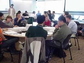
Photograph of students at work in the MIT TEAL classroomThe MIT Technology Enabled Active Learning (TEAL) rooms have 2.38 sq m per student. The University of Melbourne guidelines recommend 2 m2 per student for a "Cabaret-Style" Collaborative Learning room. When computer equipped, these rooms have one computer for every three or four students. Computer Lab equipped for teaching have required up to 4 m2 per student.
Seating Density
Type of Spacem2 per student
Lecture Theatres1.0
Seminar Rooms, tight schoolroom set-up1.5
Seminar Rooms, schoolroom with more table space2.0
Collaborative Learning "Cabaret-Style" with room to move and larger tables2.0
Computer Lab - Student Access3.2 - 3.5
Computer Lab - Teaching3.5 - 4.0

Adapted from: "University of Melbourne Teaching Space Design Guidelines", University of Melbourne, 15 December 2004.

Old Design

Old Design of Computer LabConsider a computer lab that is 7.2 x 12 m, with four rows of five desks each 1200 x 900 mm. In this case the rows of desks run down the room. Two rows of desks face each side wall. Two rows of desks with the students sitting face to face, form one large table in the middle of the room, with circulation space around it. A teaching space at the front of the room has a whiteboard/projection screen and a console with audio visual equipment and controls.

A large proportion of each desk top is reserved for a computer monitor, and PC box. Space is provided on the desk for the student to have text books and notepaper while using the computer.

For 20 students, the 86 m2 room provides 4.3 m2 each, slightly over the UoM guidelines. Can the room be made to accommodate more students, but still allow each enough space to operate a computer?

Suggested Layout

New Design of a Blended Learning SpaceSmaller, curved desks with slim computer monitors can be used with offset seating. There is then room for an extra two rows of desks, forming a second island, doubling the seating capacity.

Bulky PC boxes can be removed from the desktops to provide more work space. Less desk space is needed as most instructional material will be provided via the computer and the student will type their notes directly into the computer. However, enough space is provided for an A4 pad while using the computer, or an A4 pad and a textbook when the keyboard is pushed under the monitor.

The table end nearest the whiteboard can have an oval shaped raised area added for the instructor's lectern, with the audiovisual equipment underneath. The other table ends can be similarly rounded and provided for wheelchair and other accessibility access. A second whiteboard can be placed at the other end of the room for breakout group work with provision for a second projection screen. Additional display screens can be placed on the side walls, if needed.

Smaller Computer Desk for Smaller Computers

The size of computer desks in current use were determined when computers had large CRT monitors and processor boxes. The user had to have access frequently to the PC box to insert floppy disks or other rotating media. Also there had to be desk space for paperwork. Computers now use slimmer LCD screens and smaller processor boxes. Removable rotating media is all but obsolete, reducing the need to access the processor box. Less paperwork is needed on the desktop, with instructional material being provided via the computer and student work being typed directly into it.

A computer lab designed for teaching might currently have desks 1,200 x 900 mm, as specified in Australian Standard 3590.2-1990 single task office desks used for for screen based workstations. It is proposed to reduce the single row desks to 900 x 750 mm, with a 150 mm deep curve cut out of the front, in which the student sits. The face to face double row island desks would be 1050 mm deep, with a row of monitors down the middle of the shared area of the desk, giving each student the same space as for the single desks.

Computer Case and Monitor Size Reduction

The original IBM PC case was (HxWxD) 140 x 495 x 408 mm (XT type 5150 of 1984) taking up a large proportion of a desktop. A typical slimline desktop case is now 112 x 398 x 362 (Dell OptiPlex 330 Desktop). These are small enough to be mounted under a desktop. Manufacturers are now introducing desktop computers with the footprint slightly larger than a DVD Drive: 165 x 165 mm (Apple Mac mini). These are small enough to be placed on the desktop next to the monitor.

A typical CRT monitor is 419mm deep (Dell E773c 17-inch CRT Monitor). The depth of a typical LCD monitor is 165 mm (Dell E2209W 22" LCD monitor is 163.9 mm), saving 254 mm of desk depth.

Older PS/2 style computer keyboards are about 450 mm wide (Lenovo 31P7415 is 453 mm). Newer compact keyboards, are slightly narrower at about 430 mm (Dell PH316 is 432mm x 152 mm). Some sub-compact keyboards are as small as 400 mm.

Desk Depth

Provided there is room for the student's legs underneath, the depth of the desk can reduced by about 260 mm when a CRT screen is replaced with an LCD, without reducing the usable desk space. With the LCD stand taking up 165 mm at the back of a 600 mm deep desk, this would leave 435 mm, which is sufficient space for a computer keyboard and A4 paperwork. With the keyboard pushed under the monitor, there would be room for a textbook and A4 paper.

Desk Width

With 200mm to operate a mouse (Fellowes - Mouse pad 200 mm), a compact keyboard would leave room for an A4 notebook (210 mm) and 20 mm between each item on a 900 mm wide desk.

Fitting Desks in the Room

A row of five 1200 mm desks is 6m wide. Reducing to 900 mm desks allows seven desks in a row, with the loss of 300 mm circulation space at the front of the room. This would increase the room capacity from 20 to 28.

If the single row desks are reduced from 900 mm to 600 mm deep, the double row desks made correspondingly narrower, and the space between them from 1300 mm to 1220 mm (the US minimum for wheelchair access), an extra two rows of desks could be added, increasing the room from four to six rows. With 1200 mm width desks, this increases the capacity to 6 rows of 5 students = 30 students. With narrower 900 mm desks, this increases the capacity to 6 rows of 7 students = 42 students.

Heat output

Apart from the space requirements, air conditioning loads need also to be considered from fitting twice as many students into a room. However, the drop in energy use of modern computers will just about compensate for the heat produced by twice as many people.

The Dell E773c CRT consumes 71 Watt, whereas the Dell E178FP 17-inch LCD is only 40 Watt. The Dell OptiPlex 330 Desktop PC has a 280W power supply. The Apple Mac mini has a 110 W power supply. A person puts out about 60 Watt of heat at rest.

So an old system would produce 340 Watt of heat per workstation and the new one and a new one 210 Watt. This is not quite half, but I expect that the figures the air conditioning engineers use are based on higher power levels.

Making the room look larger

Leaving other aspects of the room design unchanged but adding twice as many students could result in a crowded looking space. Changes can be made to increase the effective space and also make it appear larger:

Curved desks occupied at the Learning Commons of the Unviersity of Calgary Library* Curved desk fronts: Having a curved front edge, projecting out 150 mm each side of the student would make the desks larger, without greatly reducing circulation space in the room. This would also better define each student's desk area. The inward curve where the student sat would accommodate an empty chair, providing additional space when the room is not fully occupied and giving it a less cluttered look. This is similar to the arrangement for casual use terminals at the Information Commons, University of Calgary.

Serpentine trading desks at Connecticut School of Business
* Staggered Seating: In typical computer labs, students sit in rows, one behind the other, or facing each other across a shared desk. If the seating is instead staggered, so that students do not face each other, and the backs of their chairs do not back onto another, there is more effective space and the room will look less cramped. The depth of the double row desks could be reduced in this way. This is the arrangement used for the Connecticut School of Business.

Curvilinear  desks unoccupied at the Learning Commons of the Unviersity of Calgary Library* Angled Seating: Typical computer labs have the students facing either the front or side walls. If the students instead face slightly to the front of the room, at about 75 degrees, this will increase the effective depth of the desks. This will also make it easier to see a presentation at the front of the room and their own screen at the same time for blended learning. In may computer classrooms it can be difficult to see the front of the room past all the rows of computer screens. This arrangement is used in the computer classrooms at the Information Commons, University of Calgary.

* Concealed Cabling: Computer cabling and power supply "bricks" commonly clutter the work surface in computer labs. Where cabling is buried in desks or walls, maintenance can be difficult. Instead the cabling can be run in a tray under the rear of the desks, and brought up through a hole in the desktop. This allows the cabling to be hidden, but accessible for maintenance. Standard, low cost power and data cables can be used with excess cable stored in the trays. The University of Queensland Ezones uses this arrangement with wire baskets under the desks to hold the cabling.

* Computers Under Desks or Smaller computers:
The largest item cluttering the desks, but the most difficult to remove, is the PC box. Previously this needed to be accessible to the student for inserting floppy disks or CD/DVD drives. But these are no longer required and the processor box can be placed under the desk, or a smaller unit fitted to the LCD stand. Extension cables can be used to make audio and USB sockets accessible on the desktop. Power sockets can be provided in the desktop, if needed for ancillary equipment, and a power switch to turn off all equipment. PCs can be mounted on the under surface of the desk, between each student, with straps, allowing them to be accessible but out of sight. Straps are used to retain computers on the USS Blue Ridge.

* Instructor Console on end of Student Desks: Teaching spaces typically have a rectangular console at the front for audiovisual equipment, controls and a work surface. This takes up space and looks cluttered. Instead, the front of one of the student desks can be extended for the instructor console. This can have a rectangular box underneath for audio visual equipment, with the top curved to match the other desktops and raised for presentation. It is used for the University of Queensland Ezones.

* Color: Labs are usually a dull mix of muted colours. The usual beige or grey plastic strip placed around the edges of desks can be replaced with one keyed to one of the building colours. This will define the space much more clearly and make it look larger, as well as more interesting.

* Computer Cut Desks: To keep costs down, and raise green credentials, it may be possible to recycle the existing desks and legs, cut to the news size. Small numbers of desks can be cut from low cost manufactured board, laminate or corrugated core sandwich from recycled wood pulp. Larger quantities can be computer cut. Modular systems as featured in "Conference and Communication Environments: Conference. Excellence" are likely to be prohibitively expensive. While movable modular desks may seem a good idea, as Dr Kathy Lynch at the University of the Sunshine Coast pointed out, they may be rarely moved in practice. Where desktop computers are installed it is very unlikely that a system which allows them to be secure and movable is feasable.

* Interactive Screens: An interactive whiteboard could be considered as part of the fit-out, as was pointed out to me at Hawker Primary School. The interactive whiteboard takes no additional space. Side walls can have have supplementary projection or LCD displays (with low power LED back lights), repeating the main image for students who can't easily see the front of the room.


ps: The curve on the desks could be a "hyperbola": an appropriate shape for the "hyperbole" commonly expressed in teaching rooms. ;-)

Labels: , , ,

Guide to designing training rooms

Conference and Communication Environments: Conference. Excellence by Guido Englich , Burkhard Remmers and Wilkhahn"Conference and Communication Environments: Conference. Excellence" by Guido Englich , Burkhard Remmers and Wilkhahn, is a clumsy title for a masterfully presented book on designing rooms for conferences, meetings, training, seminars and teamwork. The book provides floor plans for room layouts, including details of desks, chairs and storage for equipment. The authors emphasise flexible layouts with movable furniture and partitions for different meeting styles. The also address cabling and installation of computer, audio and video equipment.

The furniture, fittings and floor space specified in the book look expensive for the average educational institution, and more suited to a bank boardroom, but the ideas could be applied. After addressing individual rooms of different sizes, the authors offer designs for some larger multi room spaces, the most interesting of which is a multi-level canteen which can be converted into an assembly hall. Another interesting design is a multifunctional partitioned conference and congress centre, of the type I proposed be built at the ANU in Canberra.

The full text of the book is indexed by Amazon.com and this provides a useful supplement to the book itself, for example to find the 43 pages with references to "computer":
1. on Page 31:
"... darkening the room and media technology may be operated very easily - for example, via a touch panel. If a computer display is already integrated into the table, it may also serve to operate the above functions. Integration of media technology ..."
2. on Page 43:
"... trolley to match sideboard 2 Sideboard for catering materials, incidentals and telephone 3 Table portals with techni-stations for connecting portable computers 4 Server with video visualizer To support decision-making processes, digital media are increasingly being used in classic con- ference environments ..."
3. on Page 47:
"... Wall-installed flat screens 4 Modesty panels for privacy 5 Techni-stations, flush-mounted in table tops, for connecting portable computers 6 Mobile folding table with integrated techni-station and cable management 890 110 ~ Technical progress in the development of ( ..."
4. on Page 48:
"... for connecting portable computers 4 Retractable computer, flush-mounted in the table top, as the meeting convenor's workplace 1740 640 IRea l 1 t_^ _ ..."
5. on Page 49:
"... The dominant seat position of the horseshoe configuration is occupied by the convenor, and is equipped with an electrically retractable computer display. The back plate of the display is veneered to match the table top to create a uni- form table ..."
6. on Page 51:
"... 2 750 1 Wall-mounted flat screen with a camera and loudspeakers 2 Techni-stations, flush-mounted in table tops, for connecting portable computers 3 Retractable computer, ..."
7. on Page 53:
"... topics 5 Modesty panels for privacy 6 Techni-stations, flush-mounted in table tops, for connecting portable computers 7 Retractable computer, flush-mounted in the table top, ..."
8. on Page 55:
"... for connecting portable computers 3 Integrated microphone system 4 Mobile single table as removable segment, providing access to centre of table configuration 220 Conferences ..."
9. on Page 57:
"... 300 sgrri i Server for conference material or for catering materials 2 Techni-stations, flush-mounted in table tops, for connecting portable computers 3 Integrated microphone system 4 Retractable flat screen display integrated into the tops of ..."
10. on Page 62:
"... are generally not necessary either as participants in confer- ences do not sit in one fixed position in contrast to computer work - after all a conference thrives on human interplay with correspondingly frequent changes in posture. When selecting upholstery materials ..."


Planning Guide for Conference and Communication Environments: Conference. Excellence
by Guido Englich (Author), Burkhard Remmers (Author), Wilkhahn (Editor)

List Price: $84.95
Product Description

Englich and Remmers provide a comprehensive, analytical, and programmatic introduction to face-to-face communication in the work world. Against the backdrop of globalization, with its dynamic transformations of office environments and worldwide digital networks, they analyze the strategic significance of the various communication processes for organizational and corporate development. They show how the motives and aims of communication, the organizational forms and procedures appropriate in a given case, the size and arrangement of spaces, the required capabilities of furniture and furnishings, and modern communications and media technology all condition and influence one another. Their integrated and user-oriented approach to analysis and planning enables architects, interior designers, and facility managers to foster communication processes, structure them sensibly, and avoid unnecessary friction and needless follow-up costs, all through proper planning.


About the Author

Guido Englich is a professor of strategic concept and product development at the Hochschule für Kunst und Design Halle (Halle University of Art and Design).

Burkhard Remmers is director of communication and corporate development for the Wilkhahn company in Bad Münder.

Product Details

* Hardcover: 304 pages
* Publisher: Birkhäuser Basel; 1 edition (March 28, 2008)
* Language: English
* ISBN-10: 3764387580
* ISBN-13: 978-3764387587
* Product Dimensions: 10.7 x 10.2 x 0.9 inches


Labels: , ,

Sunday, September 28, 2008

Ecovilla buildings for classrooms

Ecovilla buildingAt Canberra' flower festival, Floriade, I came across an Ecovilla. This is a steel frame building designed for homes and public buildings. It has been used in indigenous communities and would appear suitable for a computer equipped learning centre for such communities.

Construction starts with "mega-anchors" (steel piles driven into the ground), then galvanised steel framework built up. The building is covered with a Tophat curved steel roof. The demonstration building had corrugated steel cladding on the outside and min-corrugated steel on the inside. Usually flat sheeting would be used on the inside for aesthetics, but the min-orb looks good when painted and would provide a very durable finish. The buildings can be made single or two stories high and can be provided with instructions as a kit for local assembly.

It looks feasible to use this system for building classrooms for a learning commons or flexible learning centre. Because the floor is above the ground, it would be easy to add extra wiring underneath for computers.

This is a pre-cut building, rather than a prefabricated one. That is the components are cut to size in a factory, shipped to site as a flat-pack and then assembled on site. The volume of material to be transported this way is far less than prefabricated buildings. The system would lend itself to modular building designs, with a standardised kit of components assembled into different configurations to suit local needs. The system also lends itself to the buildings being easily modified and added to. Local materials can be used to clad the building so it can blend in to the local environment.

The demonstration building had an interesting "Unitank" flat pack water tank. This looks like a giant ice cream tub, being an inverted truncated cone. The tank is transported as flat sheets of steel, then rolled up and assembled on site.

Outside the demonstration building was some corrugated steel which had been perforated into decorative fence. This made me think this would be a good way to make security windows for the Ecovilla, especially if it was equipped as a classroom filled with computers attractive to thieves. Instead of having to fit security screens, a sheet of corrugated steel with holes punched for ventilation could simply be fixed in place at the window.

The building had a solar panel on the roof and LED low power lights inside. There was a composting toilet and a clever shower cubicle made of a curved sheet of the same mini-orb corrugated steel as the walls.

Labels: , ,

Friday, September 26, 2008

Designs for the Learning Commons

Learning Commons: Evolution and Collaborative Essentials by Barbara SchaderIt is time I took "Learning Commons: Evolution and Collaborative Essentials" (Barbara Schader, 2008) back to the library, so I thought I would blog the best bits:

From information commons to learning commons and learning spaces:
This makes the case for the Library to take on a central role in learning, beyond just handing out books. I would have liked to see some of the practical issues covered. Traditional, at the universities I am familiar with, the Library was one place on the campus which was open for extended hours and staffed. Most teaching spaces were either unlocked and unstaffed (such as lecture theatres) or locked and unstaffed (such as computer labs). Just the fact that libraries have staff makes a useful improvement in service.

Curvilinear  desks occupied at the Learning Commons of the Unviersity of Calgary LibraryThe Information Commons at the University of Calgary: Susan Beatty: What were most interesting were the photos of desk and classroom designs. What are described as "curvilinear" desks (I have called serpentine). After some searching I found photos at the University of Calgary web site with similar photos to the book, showing the curved desks both unoccupied and occupied. These seem to be older photos with large CRT screens, whereas the book shows the same desks with more modern flat LCD screens. The occupied desks seem to be for individual study, having low zig-zag partitions down the middle of the desk to give the students some privacy. The students are sitting at 90 degrees to the length of the desk.Curvilinear  desks unoccupied at the Learning Commons of the Unviersity of Calgary Library

In contrast the unoccupied photo seems to show a classroom. The same style desks have the students sitting at 45 degrees and no partition down the middle, so they can see the teacher. The rows of desks seem to be much closer together.

Building for learning:
synergy of space, technology and collaboration: Susan Thompson and Gabriela Sontag:Floor plan, Kellogg Library, California State University San Marcos Interior floor plans are shown for the Kellogg Library of the California State University San Marcos. The plan shows a more rectilinear design and more stacks of books than is now common.

The Saltire Centre and the Learning Commons concept: Saltire Centre Glasgow Caledonian University Jan Howden: The photos of the Saltire Centre, appear to be works of art in their own right, unlike the utilitarian photos of other libraries. In finding these I came across "Planning and Designing Technology-Rioch Learning Spaces" (Northumbria University and JISC, 2008), which comes with a remarkable collection of resources:
  1. Case Studies
  2. Flickr Photo Library
  3. Virtual Campus
  4. Further Resources
I was unable to get some of their plug ins to work, but there is also a
printable version.There are also the Designing Spaces for Effective Learning (March 2006) and Spaces for Learning.

Alden Library Learning Commons at Ohio UniversityTransforming library space for student learning: the Learning Commons at Ohio University's Alden Library: Gary A. Hunt: DesignGroup undertook the work for the Alden Library Learning Commons at Ohio University. This shows some very narrow and uncomfortable looking desks wrapped around poles.

Georgia Institute of Technology, West Commons Improving Student Life, learning and support through collaboration, integration and innovation: Crit Stuart: Georgia Institute of Technology, West Commons is shown. This has large desks with a very slight curve along the front.

The Information Commons at the University of Auckland, Hester Mountifield: Floor plans, and papers about the Kate Edger Information Commons are available. An image gallery is also offered, but in contrast to the Saltire Centre, these photos are so artisitc as to be useless for any practical purpose.

Labels: , , , ,

Wednesday, September 24, 2008

How to Create On-line University Courses in Electronic Archiving: Part 15 - Redesign for 2008

Last year I developed and ran a short course at ANU on Electronic Document Management, reporting as I went along. The course went reasonably well and is being offered again in 2008, along with modules by others on Material Science , Innovation Management and Data Mining. Also I am to produce a module on Information Architecture and suggested one on Green ICT. But the first priority is to revise the e-document management course from last year, applying what I have learning about blended learning in the interim. Also I would like to change the emphasis from that of using electronic records to get work done more efficiently, rather than the emphasis of records managers for keeping records. There is no value in keeping records, electronic or otherwise, there is only value in what those records can be used for.

Reducing the amount of content

The 2007 e-document module, which is available via my Moodle system, was based on the material I developed for the ANU course "IT in e-Commerce" (COMP3410/COMP6341). My part of the course was "Metadata and Electronic Document Management for Electronic Commerce". As the module developed I also included material from " Writing for the web" (a short course I had run for local government) and "Extreme web design" (used in ANU course "Networked Information Systems" COMP2410/6340).

There was far too much material for a 12 hour module. The original intention was for the web design and web writing material to be in a separate short module, but that one did not end up running in 2007, thus the temptation to pack all the material into the module which did run. So now what I can do is remove some of what was in the e-document course and put it back in the web course where it can be given the depth it deserves.

No accreditation

The intention was also to apply for accreditation of the course from the ANU. However, the advice was that the 12 hour course was too short to practically fit with the ANU's longer courses. The course would need to be expanded to make it at least a 3 credit point course (half the lenght of the usual one semester courses). This would make the unit far too large for 12 contact hours. The obvious solution would be to add work for the students to do in their own time away from the university, turning this into a blended course. But that would change the character of the course and is something which will have to wait for later.

New content

The course was designed for public servants and based on my experience when in the Australian Public Service. In particular it drew on the report "Improving Electronic Document Management: Guidelines for Australian Government Agencies" which was prepared by a committee I chaired. The description of the module mentions the National Archives of Australia's "Designing and Implementing Recordkeeping Systems" (DIRKS) strategy. However, this was only mentioned briefly in the module.

DIRKS Overview

NAA provide a very detailed manual for their eight step DIRKS strategy, based on the international standard ISO 15489 "Information and documentation - Records management". (Part 1 is the actual standard and Part 2 is the guide)
One Step Process

In addition, I mentioned, but did not cover in detail "Note for file: A report on recordkeeping in the Australian Public Service", Management Advisory Committee , 31 August 2007. The MAC report suggests a simplified version of DIRKS and states that National Archives developed a quicker and more practical one-step process that complies with ISO 15489. However, the document contains no reference to where this one step process is documented and the link to an Australian Bureau of Statistics case study ‘Keep the Knowledge’ is incorrect.
A simplified one step process would be useful for this short course, as the intention is not to turn out trained records managers, but to provide public servants with as much as they need to know in relation to electronic records. However, without a document which actually details what the one step process is I will have to make up my own.

Labels: , , ,